
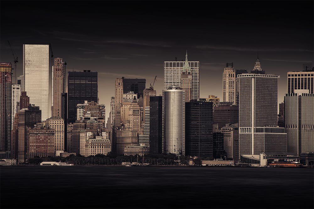
I love doing cityscape images, but they are hard to do in Melbourne because you can’t get far enough back. In the places you can do them there are usually lots of other things in the way. I mean you can do them across the Yarra River, but you don’t get a lot in your shot. I was amazed at what you can see on the Staten Island Ferry of the city skyline. It is Manhatten, at least I think it is.
As I said I took this from the ferry and so I couldn’t do my usual long exposure or anything like that, so in post I had to be inventive.
I love this image. I have done a lot of work to it. I don’t know how much time I spent on it but it would have been hours. I tried to bring out the buildings and I gave it a tone so it definitely looks different to the original. I think the original is a lot more blue.
Here is the image.
So why do I love it?
I think it is because I achieved something with my processing that I haven’t been able to get with other images. I don’t know what it is. I should go back and really study what I did to see if I can replicate it with one of my Melbourne shots.
The image in the header is exactly the same image, but I converted it to monochrome after I had done all this work to it. I think I prefer the colour version because to me the buildings stick out more. Also, the colour version is almost monochrome as well.
I like how it is a real city but it almost looks like a model of it. Not quite real. Maybe that is just me.
Tomorrow is Silent Sunday and I know I often post photos that have something to do with this post, but tomorrow I think I will do a round up of my photos from February. Pick the ones I am happy with.

It’s definitely Manhattan and it’s an excellent cityscape! I spent some time trying to decide whether I prefer the colour or monochrome version. I’m sort of leaning towards the colour one as I like the tones (I agree, it looks almost monochrome). However I keep coming back to the one more saturated bit of colour, the strip of orange on the right (is it a boat?) which I find distracting in the colour version, an issue I of course don’t have with the monochrome. Do you see what I mean, and do you agree? It makes me lean back towards black and white each time …
Thank you Sarah. That bit that annoys you doesn’t bother me do much, but the monochrome just doesn’t have enough contrast and I don’t think the buildings stand out enough. Of course, very easy things to fix.
Initially I preferred the black and white shot but on reflection I think you are right, the buildings do stand out more on the original. I would be proud of both photos.
Thank you Paul, glad you like the colour one.
Very striking photography. I grew up in upstate NY. Never was a fan of Manhattan.
Thank you Jean, I thought it was an interesting place, way bigger than I imagined, don’t think I would like to live there.
This (the NYC skyline from the ferry) is a fabulous image. As a New Yorker, I think it captures the density and variety of the Manhattan skyline very well. Not sure what you did in terms of post-processing, but the result is excellent. I think I like the monochrome version a little better.
Thank you Joanne. That’s good to hear your take as a New Yorker. I can’t remember what I did, lol. I got your email, and will get back to you soon.
The best view of NYC is the ferry to Staten Island. I drive that way to see my sister twice a year in Jersey, and I haven’t been to NYC since 2001. I think The City been going downhill.
Yeah I agree and it was good that it was free. I think many cities are going downhill sadly. Thank you Ziggy.
True story, 2001 we went to New Jersey to visit my sister. We parked in Staten Island and took the ferry boat across. We went ice skating in Central Park, and visited Time Square. On the way walking back to the Ferry Terminal. We past the Twin Towers. I wanted to stop and give my boys a treat, but my wife told me we will do it next time “It will be there the next time we come up”. Moral of the story, don’t put things off.
Exactly, you shouldn’t put things off. How long after your visit were the towers hit?
We were in NYC in January, so 9 months before hand.
So very recent to when it happened.
Excellent edit!
Thank you Egidio.
Love this one Leanne!
Thank you Anne.
From the ‘ferry’, very cool. I was on it once. Everything was bright colors, a bit confusing, don’t remember much more. Of course it was 60’s.
That was a while ago Ted, so I can understand why you wouldn’t remember much, thank you Ted.
I like the color version, too. It’s very metallic-looking. And like you said, it looks like a model.
That’s great to hear Donna, I like the metallic-look that you have suggested. Thank you Donna.