Such a great cross section and different interpretations to the theme this week. It has been wonderful seeing them all and I am sure you will love them as well.
The next theme, for the first Monochrome Madness in July, will be HIGH.
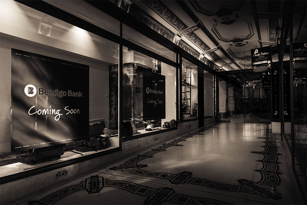
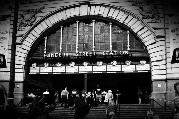
I managed to get this the other day while in the city. I noticed that the end was closed and you couldn’t walk through, which you usuallycan. Looks like things are changing here.
Don’t forget all the instructions on how to enter your own images are at the bottom of the post. If you have entered an image then please remember to check your image in the gallery, scroll down and see if anyone has left you any comments.
[envira-gallery id=”3232″]
- 1/ DUTCH PHOTOS
- 2/ One Day | One Image
- 3/ Nick Watkins Photography
- 4/ GEOTOPOI
- 5/ DBisley Photographer
- 6/ Ryan Photography
- 7/ MICHELLE LUNATO PHOTOGRAPHY
- 8/ Rainbow Junkie
- 9/ MyBlog – solaner
- 10/ sv-takeiteasy
- 11/ THEPHOTOSEYE
- 12/ Drawing with Light
- 13/ Not A Small World After All!
- 14/ Rajiv Chopra
- 15/ PK PHOTO OF THE DAY
- 16/ Crow Canyon Journal
- 17/ The Shady Tree
- 18/ THE RUNES OF THE GATEKEEPER’S DAUGHTER
- 19/ Lisa Chelkowski
- 20/ rainy day reflections
- 21/ artkorppi II
- 22/ Half a photograph
- 23/ Wendy Philip Photography
- 24/ THE WORLD IS A BOOK…
- 25/ Stupidity Hole
- 26/ Leanne Cole
Don’t forget all the instructions on how to enter your own images are at the bottom of the post. If you have entered an image then please remember to check your image in the gallery, scroll down and see if anyone has left you any comments.
Monochrome Madness each week and if you wish to participate and submit an image here is how you do it:-
- You must email me the image you want to include and if you have a blog or website, or somewhere else, please include the link. My email address is leanne@leannecole.com.au
- The image size should be low res, so the largest side should be 1000 pixels or less.
- Please insert either your name or your blogs name in the file name.
- Remember I am on Australian time, so with GMT I am +11 hours at the moment, I publish my post on Thursday morning.
- If you need more help with sending images, and get confused about time zones, etc, well, there is a great website called The World Clock, if you go to that and look at Melbourne time, if it’s before 6pm on Tuesday evening, then you can still send me images. If it’s after that time, you can send me an image, but it will be set aside for the following week.
- Remember to include a link to your blog or website.
- Please remember to resize your images, it is fairly simply, you just need to go into any editing software and usually under Image you will find, resize, scale, or image size, something like that and you can resize your image there. Change the dimensions to pixels and make the longest side 1000 pixels or smaller, hit return, and for most types of software that should change the other side automatically as well. Just remember to save it with a different name so you know it is the smaller version. If you have any problems, please contact me, I don’t mind helping out.
Please note you don’t have to be a WordPress blogger to be in this challenge, you can have a link to a Facebook page, a Flickr page, anywhere really, or no link. We just want to encourage people to do monochrome images, just for the madness of it. Just to let you know also, that as soon as the challenge is published, all emails and images you have sent me are deleted from my computer.
Lovely feel to yours Leanne. What a beautiful arcade.
Thank you RJ.
Hi Leanne, is it just me, but I am unable to scroll down on specific images anymore and leave comments. It may be that I now access your blog thru Bloglovin.
Wendy, this theme won’t let you do that unfortunately.
Great collection, as usual. My top 5 are: 3, 4, 26, 14, 10
Great Solaner and thanks for mine too.
🙂
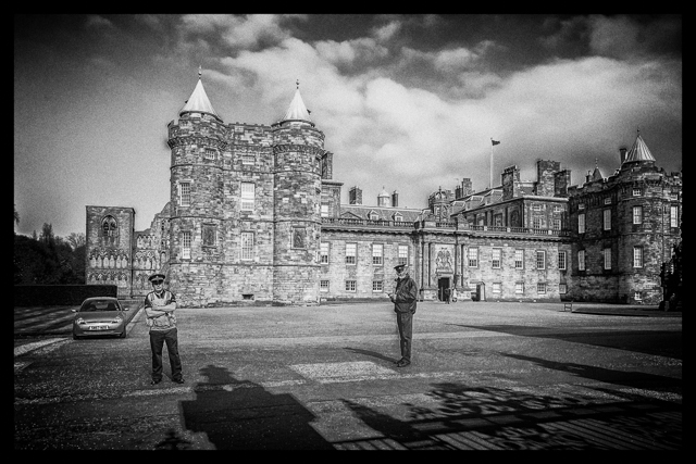
I love Crow”s Holyrood and that empty feeling your image has! All of these are great, each has it’s own quality. Well done fellow Madnesses!
I love the story behind Crow’s image as well. Thank you Cybele.
You are right, Leanne. It is a great cross-section of images. I always enjoy finding the symbolism within these themed images. They say a lot! Great capture this week, the optimistic “coming soon” paired with the construction and old building charms on the ceiling give a lot for the viewer to look over. I don’t usually give a top 5 but am feeling interested in doing so this week. #15, #16, #4, #10, #26. Wonderful entries everyone!
Good to hear you agree Carrie. I love seeing how people respond and am often very surprised, which is great. Thank you, it is part of a great old arcade, and perfect for this theme, I thought.
Favourites here would have to be all of them. They’re all so good!
that’s a great response.
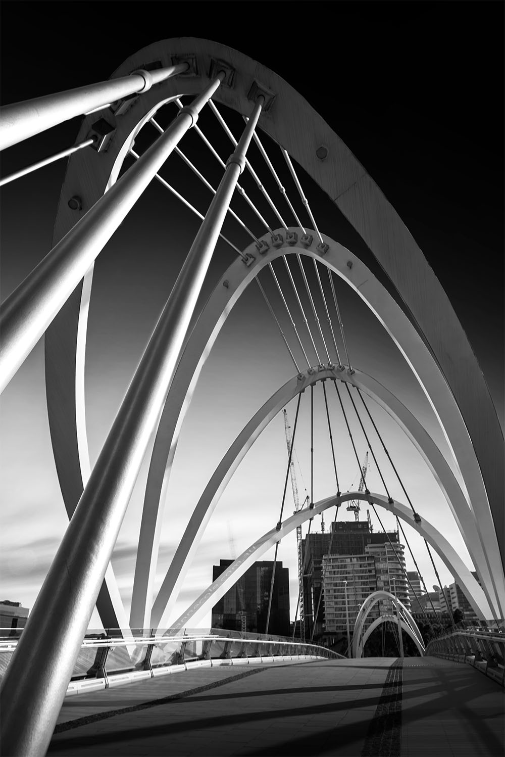
Leanne this was a great theme and great entries this week. Lovely shot – beautiful tones and I love the sun rays (or light rays) – perfectly placed!
Thank you Debby, good shots all round.
These sparked quite a conversation between hubby and me. It seems that partial pictures are “in” now. The other thing that drew my attention is what a smooth silky feel your picture of the shopping center has. It reminds me of mercury, shiny, but swirly and rich. It’s almost like a 1940s movie star look. I don’t know if I’m explaining that very well, but do you know what I mean? What did you do to make it like that?
That’s good to hear Marsha, discussion is always good. Thanks for that, I don’t know about my image, I added a creamy colour, the black and white just seemed too stark. It is very old arcade, so perhaps that helps it. Well old for Melbourne.
Maybe that was it. It’s gorgeous!
thank you Marsha
Loving the entries this week Leanne… and loved the entry by Nick Watkins Photography… a woman’s worst nightmare especially when you’re bursting to go… 😀 😀
Great to hear Bren.
wonderful gallery.
Great Klara.
I’m sorry to see mine missing. I sent it at midnight, that is 17 hours ago. Too late?