It is interesting how you can process one image in two different ways and give it two completely different looks.
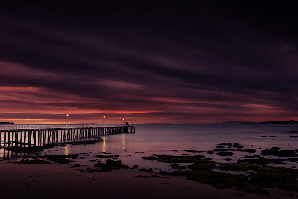
I took the following image of Point Lonsdale Pier at sunrise last year. It wasn’t an especially inspiring one, but it was very early. There really were too many clouds for it to be a good one.
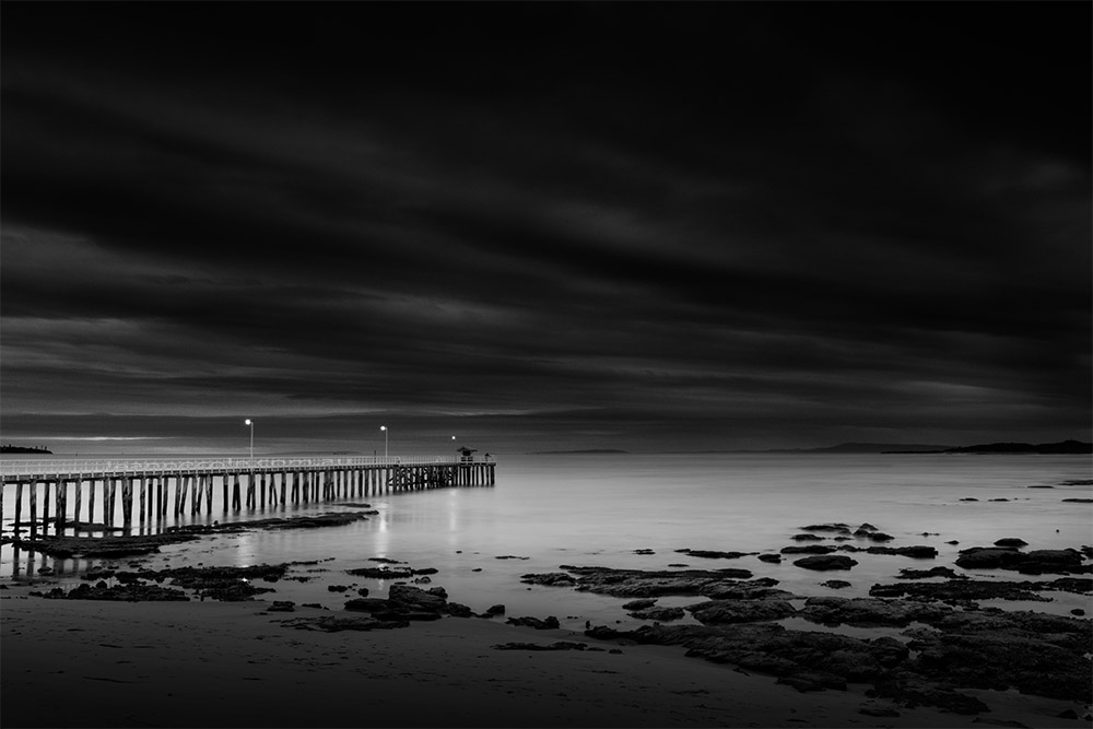
Initially, I thought I would try the image in monochrome and see what I could get.
The water is very light, and seems like there is light on it when it was very dark.
Then I wondered what it would be like if I made it colour again.
It seems almost like this one is a different image and taken later in the morning, but I assure you they are the same image.
In the end I couldn’t decide which one I liked more. I asked my husband which one I should put on Instagram and he said the colour one. I did and people have seemed to like it. I don’t know, which would you choose?
Colour 🙂 🙂
Thanks Jo.
The colour version. It transports me.
Thanks Elen, I like that.
Very different moods. Both great, but I favour the coloured one!
Thanks Chris.
Wow, Leanne. They both are gorgeous. I love the moodiness of the b & w and the colors in the second one.
Thank you Patti, they are quite different.
Interesting comparison, Leanne. The colour one grabs me because of the beautiful colours of sunrise but I feel if the image is about the pier then the B&W is the stronger one because my eye is drawn to it within the frame. In the colour one it is only part of a pretty scene.
Interesting observations Lee, nice, thanks for sharing them.
I love the darkness and mystery in the monochrome version but the coloured is out of worldly!! Sunrise on a moon of Jupiter? lol.( without the pier of course!). I can’t choose! Happy Easter Leanne.
I love the way you describe them Cybele, I couldn’t decide either. thank you, I hope you had a good easter too.
I will tell you about it!
Please do!!!!
You present a very hard choice! I am leaning toward the color image because of its impact, though as a print, I think I would prefer the monochrome. How’s that for wishy-washy? 🙂
About as wishy-washy as my John, I was the same, couldn’t decide. Thank you.
Forgot to say. I prefer the monochrome
Thanks Jim.
For me there are two distinct pictures. Each of them is wonderful in its own category. Any preference is a matter of personal taste of the observer, not of the picture itself.
I agree Jim, I think the same. Thank you.
I notice in the b&w version that I am drawn to the pier, water, and foreground rocks. With the color version I feel a little distracted as to the energy of the photo. So, I favor the b&w version. After reading Mike Powell’s comment above, I scrolled partway down on the image, and feel this works as a panorama, too.
Interesting observation, yeah, but if you cut the sky out I would lose the part I love, I love the drama in it. Thanks for your feedback.
Hi Leanne – The mono has higher contrast over the water and I can see sharp detail in the rocks and pier that are still shadowed in the colour version. I like the moodiness of it a lot and wouldn’t complain about the heavy cloud at all. Wes.
I like the heavy cloud to, I like the drama it causes. Thanks Wes, great to hear from you.
Hi Leanne, Although I am a B & W fan I find that the Colour one grabs me more. This one is just not suited to B & W in my humble opinion.
I don’t know that it isn’t suited, it is just different, thanks for your feedback Ron.
Both are really great images, but my eye is drawn more to the one with no color.
No colour, interesting Tiny, thanks for your feedback.
Great, thanks John.
Colour.
Thank you.
These two images have very different moods – the B&W one feels cold, the colour one is warm. That may sound a very obvious comment but not all B&W images feel cold but this one does, and I believe it is the consequence of the over-bearing sky. Very often I find my B&W work conveys a totally different message from the original colour version, and that is one of the strengths of the medium – it can create a variety of moods that colour cannot achieve. And to answer the question…I really like both, Leanne, and it would be difficult to choose one over the other.
I get what you mean Andy, I like the dark skies, they give a lot of drama to the image. I love drama, lol. So you are in my camp, can’t decide, thanks for what you said though, interesting ideas.
Color. I’ll have to try that.
Thanks Anne, yes, see what you get.
I like them both but for me the color is my favorite.
Seems to be a favourite choice, thank you for letting me know.
Great captures of lights! Beautiful process results. 🙂
Thank you Amy.
For this one, Leanne I prefer the colour version for two reasons. One is the blend of reds and purples that it shows, which is a quality worth retaining. Second, it brings out more from the lamps along the wharf-showing that they still think it is night-time but the day is coming up.
I do love purple, I like what you have said, thank you so much.
I prefer the mystery of the black and white version. I like the zig-zag lines formed by the clouds, pier, shore, and rocks. They are both wonderful, though!
Thank you Barron, interesting, I like the way you describe it.
Very interesting what one can do with the same image! I will try it with one of my lake pictures.
It is Peter, so many things you can do.
I like all your images, Leanne. The monochrome ones are moody and reflective, whereas the colour one is celebratory. Hard to choose but I’ll go for the colour one as it cheers me up. Amazing that they are the same picture!
That is interesting Irene, I had never thought of them in that way. It is amazing, shows how much you can do to an image. Thanks Irene.
I almost always prefer colour imagery to black and white. It’s how most human with healthy eyes see the world. A few animals see only on black and white but not humans. So when I look at live scene I can’t help noticing the colour of the sky or the rocks or vegetarian of anything else in the scene. When I push the shutter, I’m trying to capture the scene as my eyes saw it.
That is true Khürt, I’m much the same, I prefer to work with colour. I like the way you look at it, great, thanks.
color for sure Leanne 🙂 great image with wonderful colors!
Thank you Pieter, that is great.
You are right they are both good in different ways. But I do like the rich colours of the sky in the second.
The sky in the colour one is turning out to be popular, thanks RJ.
I love the coloured one in this instance.
Great, thanks for letting me know Carolyn.
Colored one. It’s beautiful!
Thank you Parul.
The color one because it seems brighter and more cheerful.
Thank you Sherry, it is certainly that. 🙂
They are both great pictures. But I have to agree with your husband I like the color better. It makes the clouds more dramatic
I will have to let him know, thank you AYR, must appreciated.
Both of them are very lovely, Leanne. Just by looking, the first one looks like it’s a night time shot and the colour one a sunrise/sunset shot. I prefer the colour one, but that is because I like colour personally. Love how the purple colours of the sky reflect onto the water – it almost looks magical and hard to believe. Beautiful all round.
Those were almost exactly my thoughts Mabel. Thank you for letting me know.
I think that I too would have gone with the color version. The colors in the sky grab me in a way the sky in the black-and-white version doesn’t. However, I really like the bottom two-thirds of the monochromatic version and think it might look cool as a panorama-format shot, with part of the sky cropped off.
I am quite partial to dark skies I think, I like the drama they cause. Interesting observations Mike, thanks for responding.
Love them both but the coloured one would be my favourite!
Thanks for letting me know.