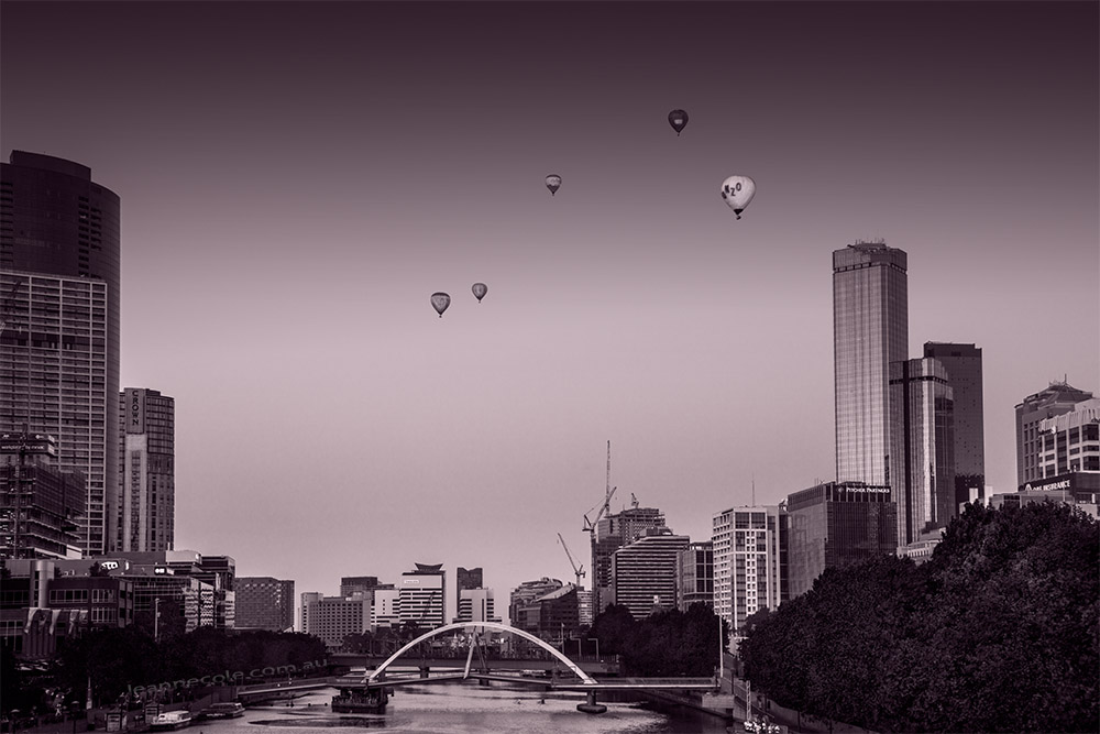
It is Monochrome Madness over on my other blog and I thought I would do another image where I process it in monochrome and then switch it back to colour. Here is the black and white version, or monochrome really.
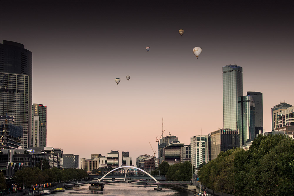
I was in the city the other day and we were trying to get the sunrise from Princes Bridge in Melbourne. It was a strange one, so after a while we decided to head over to the other side of the bridge and watch the city waking up along the river. As we were there taking photos a couple of balloons came along, then there were three, and then we realized another two were coming, so five all up. It certainly added to the scene.
It was dawn, but facing the other way. Even thought there wasn’t much of a sunrise that morning, there was some colour in the sky, a pinkish sort of colour. I thought the whole image might be nice with a pink tone, give it the look of early morning. It couldn’t be too strong, but I don’t mind how it came out.
Then I wondered what would happen if I put the colour back into the image, my reverse processing. I haven’t done it for a while.
I haven’t taken out any of the colour in this, but I did have to tone down the pink tone a bit more. I like the look of it. It is different from the monochrome one, which is nice. There is something very graphic about it, I can’t explain it, and I don’t know if it is the buildings or what, but there is.
I don’t know which one I prefer. I like them both for different reasons.
If you want to see more great monochrome images head over to my other blog and the post, MM 2-45: Monochrome Madness. There are some wonderful images there.

The colour version absolutely looks the best. Looks like a fusion of post- and pre-modernism
Interesting, I like that, thank you.
The color shot has a futuristic quality to it that I like.
That’s an interesting observation Elen, thank you for sharing it, I like it.
Hi Leanne, it’s always interesting to do a B&W / Colour comparison isn’t it!
For me , I prefer the colour one,as it appears to have more depth and clarity, although ( on my iPad ) the foliage on the tree, bottom right, has a yellow side and a green side sharply divided probably by the early sun through buildings but personally I find it distracting!
I like the B&W but maybe it should have a different treatment, in the colour version there is an orange/ pink haze or glow low down which looks good but in the monochrome version it converted to a dark foggy look which I don’t find appealing and also the trees foliage have gone muddy. This reminds me of using black and white film and my struggles to find the right colour filter, eg green or yellow to bring definition and clarity to the foliage of trees, perhaps it was just my exposure or film developing, so many variables!! ..Arrgh!
I really liked those partially desaturated city views you posted the other day!
Cheers
I guess it comes down to what people prefer. They are just images for MM, I don’t mind them, they are okay, sorry you don’t like them.
Thank you John, I can’t decide between them.