This is a repost of sorts, though more a redo. Today’s U4D post was written a few years ago, when people wanted more information on how to do images in monochrome. I have redone it and hopefully updated it some.
Is has been good to have the monochrome challenge back, but I know that people still struggle with what images will convert to black and white easily or well. There are also the different ways that you can convert them, what software to use.
For todays Up for Discussion post I thought we could revisit this. However, let’s make this a real discussion and I want to hear from those that do monochrome images.
What do you think when taking them?
How do you process them?
U4D: Images in Monochrome
The Image
Textures and Patterns
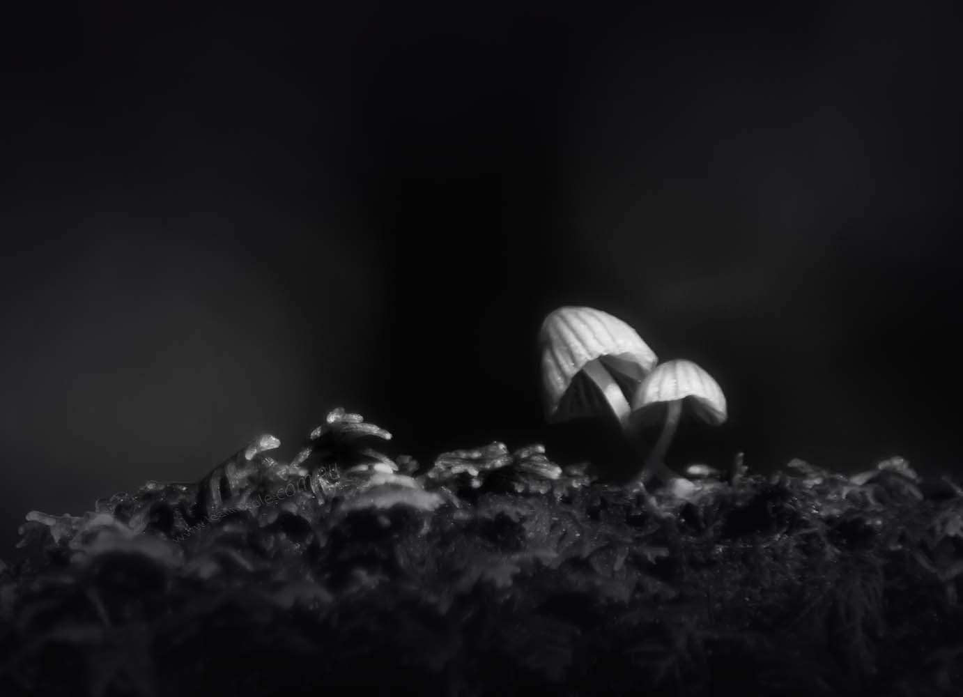
Not every photo you take will be a good as a monochrome image, sad but true. There are things to look for when you are going to convert an image. Images with lots of textural elements or patterns are great for monochrome, the patterns and textures can really stand out.
Contrast
Really what a great monochrome image needs is lots of contrast. I am going to try and explain contrast because I know a lot of people say they know what it is and they don’t. I used to be one of them. People say to me it doesn’t have enough contrast and it took me years to work out what they meant.
So, contrast is about the difference between the whites and the blacks. If you have ever used the threshold on an image, and converted it to just blacks and just whites, then you will find an image with a lot of contrast. Though the image would look crap, a good image would have blacks, and whites and lots of shades in between.
What you are looking for are lots of tones or greys from light to dark. Often images that don’t have a lot of contrast just look grey and not very good.
Tones
If you want to know if an image will be good for black and white, look at the tones in the image, the lights and darks, is there enough of a difference.
Remember that some colours will have the same tones when converted. For example, red and green will have the same tone, and when you convert they may look the same. Dramatic images often lend themselves very well to monochrome as well.
Camera
It is good to remember that most cameras will allow you to take photos in Black and White with a setting on the camera.
One way is to take Black and White photos, but then you lose the flexibility of your image because you can’t make it colour again. If you are shooting in jpeg this can happen, however, it doesn’t if you are shooting in RAW.
The other option is to make your screen show you the preview in B&W. The images are still colour, but you get an idea of what it looks like in monochrome. I don’t do either, but I know people who do. To be honest, I just don’t think of it. If you are new to this and learning, then changing your screen to give you the preview could be very beneficial.
Zone System
The zone system that Ansel Adams developed is something that people often talk about. I’ve never been able to work it out, I haven’t been interested enough to really study it. There are others who have read it and used it to get better images. If you are really stuck, could be good to look at.
Taking Images
It has been suggested that if you have the intention of getting images in black and white, then when you set out to take them, remember that, and look at what you are taking. Think about whether it will be a good image for monochrome.
Converting to Black and White
Simple Editing
There are so many ways of converting images, and it really is an individual thing. There is no right way or wrong way of doing it. You can do what works for you. The most common thing to do is to reduce the saturation and take out all the colour in the image. You can go to the menu and find where you can convert it to greyscale. They are the two most common ways that I can think of to convert your images.
However, neither of these ways are highly recommended.
Black and White Adjustment Layers
Photoshop has an adjustment now that allows you to convert them, you can click that and your image is monochrome, then you can adjust the individual tones in the image to make them darker or lighter, according to how you want them. It is one of my preferred methods of doing the conversion. I will often give the contrast slider a little push as well for extra effect.
There are many so many other photo editing programs available now and they nearly all have some sort of way to do this conversion.
Plugins
There is also lots and lots of software that will help you get that black and white effect. You simply open your image in them and hey presto there is your black and white image. There are many around, with the most popular one being Silver Efex from the Nik Collection. Though this software has changed hands a few times now, it is still available.
I know Topaz Labs also have one, but I have never used it, so I don’t know what it is like. They usually have a heap of presets, to help you decide exactly how you would like your image to look.
Actions/Presets
I have also seen some actions that when you apply them, they will convert your image to black and white, however you need Photoshop to use them, though I believe you can also use them in Elements, but I’m not positive about that. You can often pick up an action quite cheaply or a bundle of them. I am experimenting with doing them, perhaps I should do one for people.
If you are using Lightroom there are presets available that will help you do the same thing. They work in a similar way to actions.
Conclusion and Photos
I am leaving it there, so I am hoping those that are much better at monochrome will help add more information. What little tips can you give people who want to get better at doing them?
For those of you who want to learn how to get better images, try looking at more monochrome and if you don’t like an image see if you can work out why, or why the black and white doesn’t work.
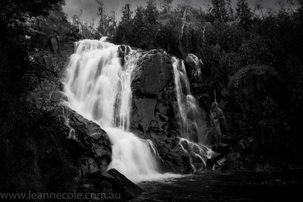
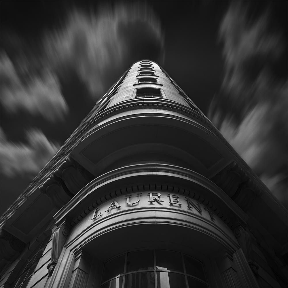
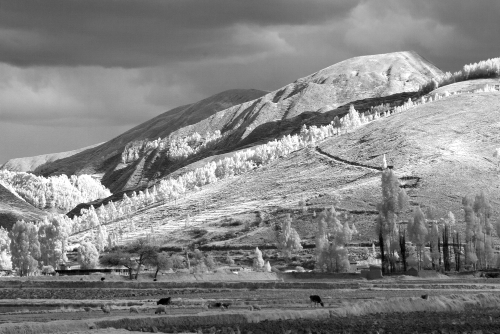
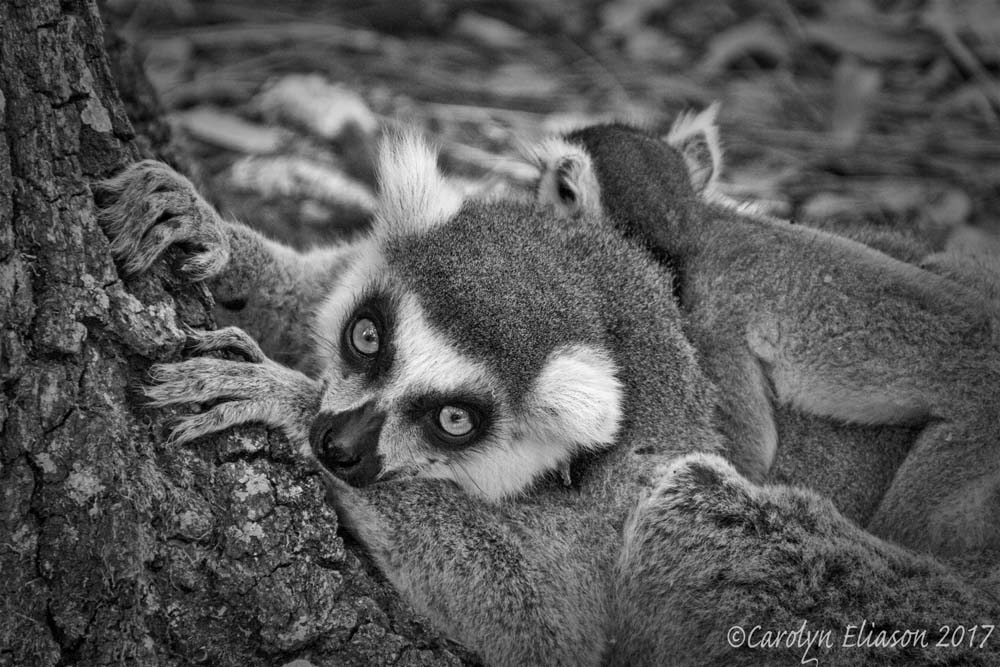
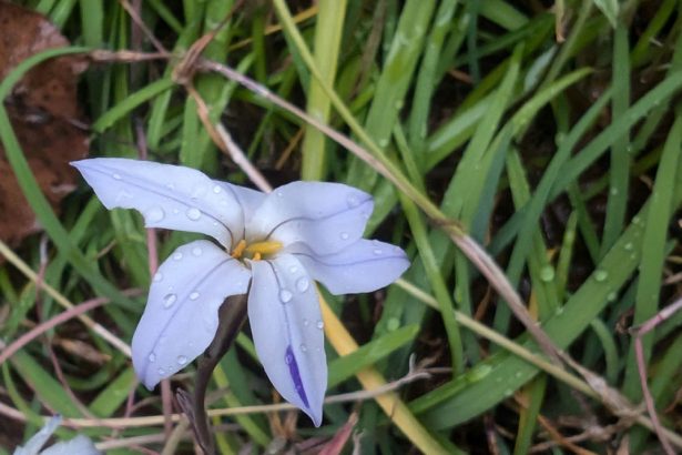
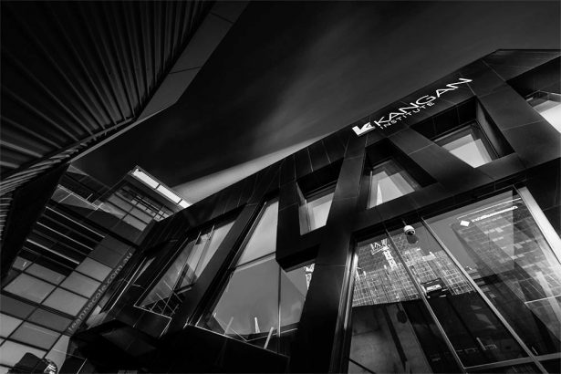
All the images today are ones I’ve done in monochrome. I am fairly certain they have been on the blog before, some for monochrome madness, and some just, well just because I wanted to. If you look at the file names and see SEP in it then it usually means that it was done in Silver Efex.


I love monochrome images and I dabble in them from time to time. The zone system of Ansel Adams is a difficult concept to grasp. In a simplistic way, I think he advocates that a photo should have brightness levels of all the 10 zones. The following photo has been edited with this in mind. https://www.facebook.com/MonochromePics/photos/a.458919444303516/1056082631253858/?type=3&theater On the other hand, I love your photos that seem to break that rule with the stark contrast between bright and dark elements.
Yeah, it is a complicated system, I just couldn’t be bothered learning it. I like doing mine my way, I think that’s okay. Thank you Erich, good to hear you have tried to use it. Good job.
I love this one Leanne!!
That’s great Cybele, thank you.
Most of the time I consider very quickly before shooting whether it’s most likely I’ll post process as monochrome. I’m very fond of monochrome from my early film days when first learning photography at Art School and it was the cheaper film obviously. But I also remember being taught to consider whether or not the image would lend itself to colour or monochrome by virtue of some of the attributes for the image being created. So although it’s an instinctive process now, I’m quickly assessing whether the image is going to emphasise texture, shape, pattern, structure. Then whether or not colour will enhance that or distract from it. I find it’s a solid support for the composition.
Fundamentally for me monochrome focuses the viewer on the graphic and structural aspects of the image. If colour enhances that then well and good, colour it is, but if it’s going to be a hindrance to the vision and feel then it’s not valuable to the image. On occasion when I get the shots onto the computer and pull them up the image doesn’t seem to work despite the original intent for colour. I’ll then give it a shot as monochrome and have been pleasantly surprised.
My 20 cents worth.
I always shoot for colour, I like colour and monochrome is a bit of a challenge, but I like trying things in it.
Thank you for sharing your 20 cents worth Craig, I see inflation has hit what your thoughts are worth as well.
Thanks very much Leanne – did ask a similar question on the TPM page and if Ok will save this – love the images and will now look at my photos and see what it is I should be looking for, textures etc. Cheers
You’re welcome Pauline, I hope you got some good advice on the page, I don’t always see what is asked there. I do have a lot of stuff here on this blog though. Thank you so much, I hope it helps you with your images.
Another great beginning tutorial. Still trying to finagle your use of tints on so many of your great art
Thank you Bob, I hope it is useful. It is all about experimenting really. Have fun.