Our third themed Monochrome Madness this week and our host is Sarah from the blog Travel with Me.
She has set her theme as textures. It is an interesting theme. One I sort of struggled with. I tend to think of textures as those things you put over photos to create some sort of effect, but what is a photo with texture?
I can’t help it, but I tend to think of old things that are worn. That is probably wrong, and I guess most things have textures. So I have put together a gallery of things that I think have textures. I hope it fits the brief.
Thank you Sarah from Travel with Me for being our host this week. I’m not sure when she is posting, but please check in with her post and see what she has to say.
Participating in Monochrome Madness
If you would like to participate in this challenge please post photos on your blog and use the tag Monochrome-Madness, then I can use the reader to see what you post.
You can also leave a pingback, do they still call them that? Basically, you put a link to my monochrome madness post in your post and it leaves a link in the comment section.
Don’t forget to check out the Monochrome Madness page. On this page, the next theme is announced and there is also all the information for participating. We have also included a list of themes that will be coming in the future so if you want to be able to plan ahead you can. They aren’t in order, but will happen. Please go and check it out. Click on the Monochrome Madness heading in the menu.
Also if you would like to host one week or more, let me know.
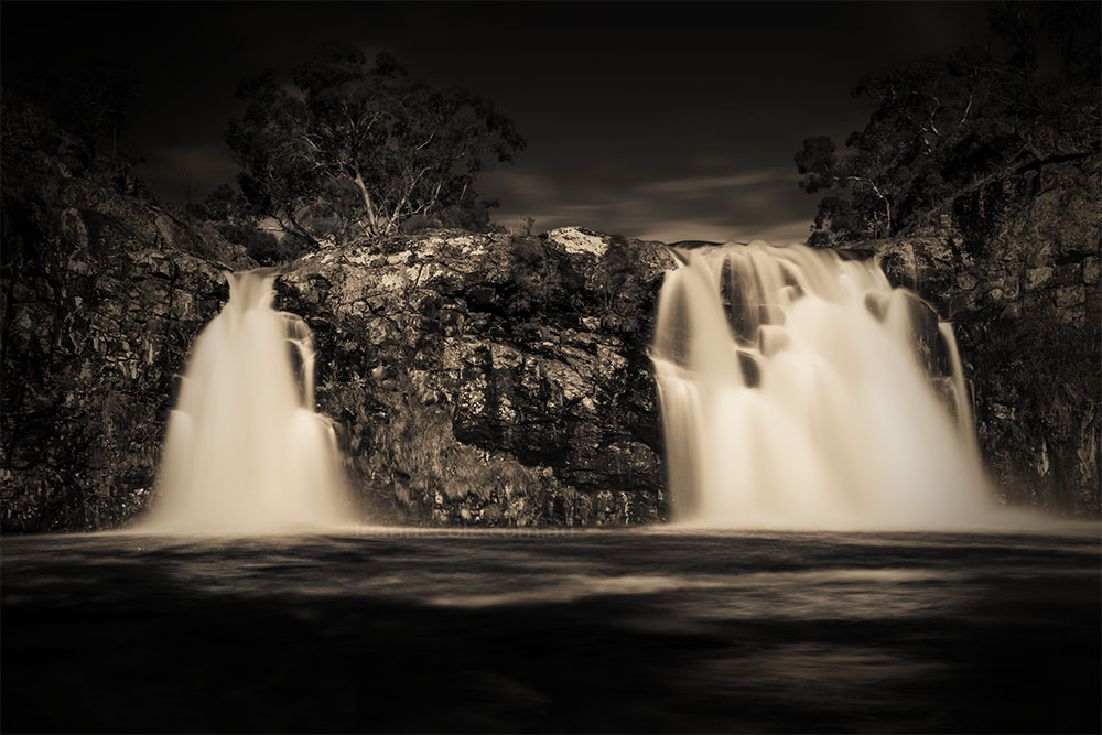


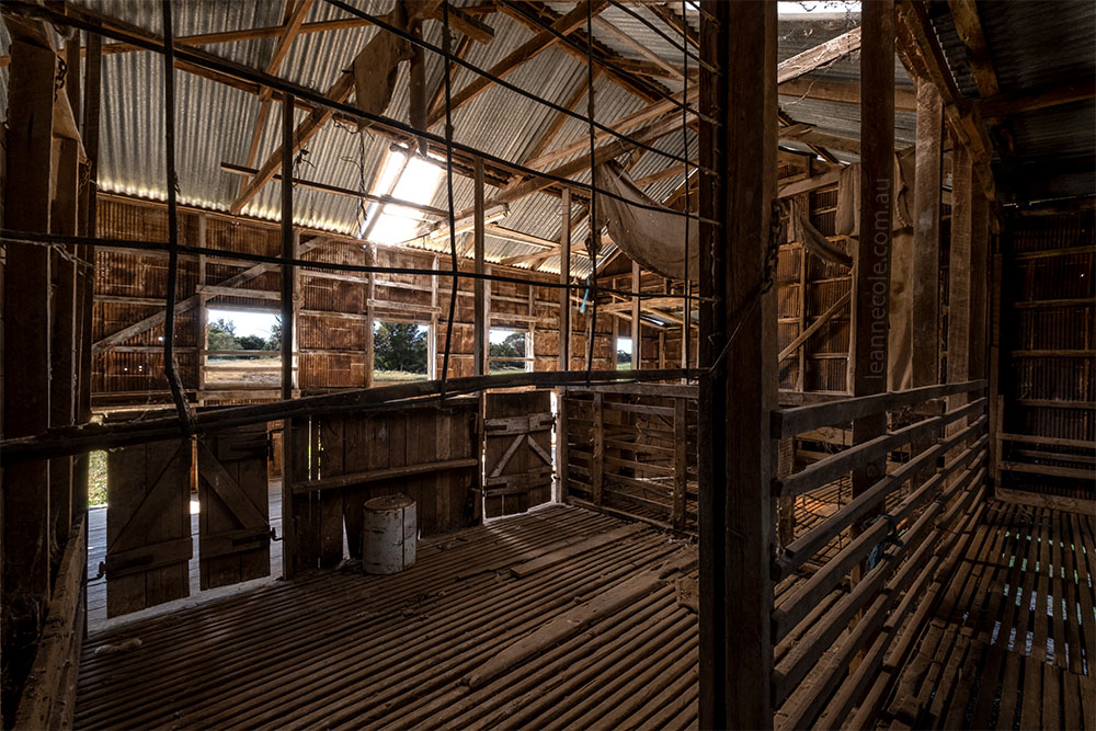
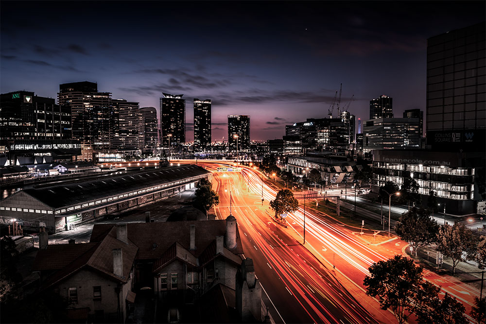
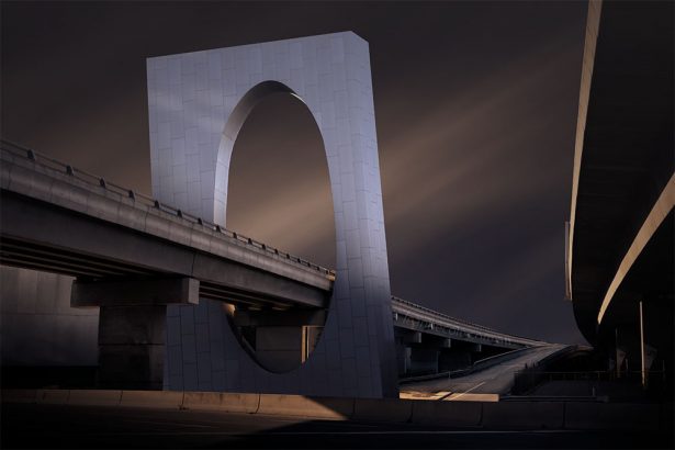
Beautiful shots
Thank you.
Beauty lies in eyes of viewers
Thank you.
You’re welcome 🙏
😀
The old bus and old car looks stunningly wonderful 🙂
Thank you, they were great finds.
Great variety of textures Leanne 🙂.
Thank you PR.
I think the texture of things shows up particularly well in monochrome.
I have to agree RJ it really lends itself well to this. Thank you.
These are beautiful images, this stood out most for me. scsunflower-HDR2bw
Thank you Ritva, I did that image so many years ago.
Wonderful examples, Leanne. I adore the sunflowers!
Thank you Elke, that is really good to hear.
Hi Leanne – my post is now up: https://www.toonsarah-travels.blog/gallery-monochrome-madness-seeing-textures-in-black-and-white/ I love your examples, especially the dead sunflowers and rusty old vehicles 🙂
Thank you Sarah. I’ve changed all the links too.
Very nice collection 👏👏👏. I need to start visiting your site using my browser. The images are large and clear 👍
Thank you Ted, I don’t know that it would make a big difference, would it?
The browser displays larger than in reader. Some themes, yours seems to be one, restrict the sizing when viewing. Your style is best viewed (IMHO) larger for full impact. Typically I view reader on an IPad. Stats show the vast majority of people use tablets with viewer. Tablets might be why some themes have restrictions.
That is true, it does show them larger. Oh I didn’t know that about the them. I know it can be hard to look at the photos on the phone, but thought it was just WP, maybe I need to look for a new theme. I have no idea, maybe I need to do some research. Thanks for that information Ted. Oh and you did post twice so I will delete the other one. I moderate and the comments don’t appear until I approve them. I’ve had trouble in the past so I do that.
Thanks, I thought it was the WP police coming for me 😂
Nah, my police, me, lol
😁
😀
Gorgeous!!
Thank you.
Beautiful textures Leanne!
Thank you Anne.
Very Nice!
Thank you Ziggy.
Thanks for sharing this idea Anita
You’re welcome.
Love that bottom car shot! To me, that implies texture. Anything with a rough surface due to rust or its composition (think brick) works for me as to texture. And of course, black and white has a way of emphasizing it.
Yeah, black and white is great for texture. I love that old car but it seems every time I go to it it has been stipped more. Thank you Rick.