A few weeks ago, I showed you the photos below, but this week, I thought for the free week, it might be fun to do them in monochrome and then see what we think. If you need to take a look at the original post again, you can find it by clicking here.
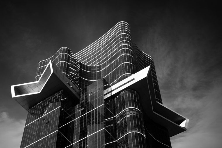
Australia 108 is a blue and yellow building so I have to ask myself, what do I lose in the images if I take those colours out?
Though I’m wondering if they are too dark, I might have to rethink it. I really wanted the white to stand out more, so I put in more contrast to help facilitate that.
These are exactly the same images from that previous post. I didn’t do that much more to them.
What do you think? Colour or monochrome, which looks better?


Next week for Monochrome Madness #44 our host is Sarah from Travel with Me and she has chosen the theme RUINS. Should be interesting and I’m looking forward to seeing what people post. I will have to really go looking for some ruins in my archives. Wish me luck.
Participating in Monochrome Madness
If you would like to participate in this challenge, please post photos on your blog and use the tag Monochrome-Madness, then we can all use the reader to see what you post.
You can also leave a pingback, do they still call them that? Basically, you put a link to the host’s monochrome madness post in your post, and it leaves a link in the comment section.
Don’t forget to check out the Monochrome Madness page. On this page, the next theme is announced, and there is also all the information for participating. Please go and check it out. Click on the Monochrome Madness heading in the menu.
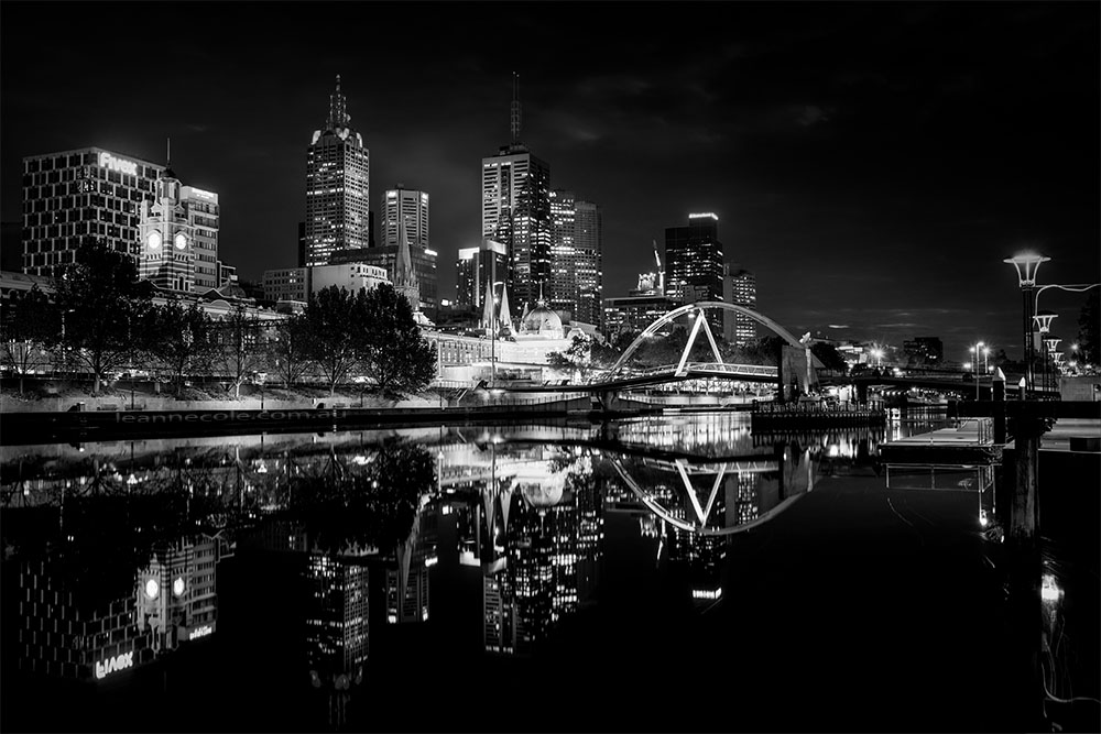
For me, monochrome offers the best way to focus on line, the play of lines and forms.
That makes a lot of sense Penny, and it a good thing about monochrome. Thank you.
The black and white are a little spooky… but they really make you concentrate on the building’s features. All fab! Linda 🙂
I totally agree Linda. Thank you.
Reminds me of Gotham City
They look great in black and white
I like that, thank you Alison.
hello leanne,
A wonderful selection of pictures you’ve chosen for this week. I really like them, especially the first, second, fourth, and last ones.
Here is my contribution to the challenge, https://wp.me/pfnz9O-TE.
Many greetings, Robert
Thank you so much Robert.
I think I very slightly favour colour for these, apart from the one bottom left in your gallery which is very striking in monochrome!
I quite like it too, thank you Sarah.
I did find that the monochrome allowed me to concentrate on the unusual shape of the building rather than being side tracked – asking what are those funny orange bits? I am sure photographing tall buildings like that is tricky. You have done it very well.
I guess that is something that is really good with monochrome. I have no idea what the orange bits are, just some sort of decoration I guess. Thank you RJ.
these are really unique architectural buildings, and you photograph them so well. I like how you use contrast in your images.
I think they are too Ritva, we are so lucky in Melbourne. Thank you so much. I was taught it is black and white is all about contrast.
I did comment yesterday, but it seems to have gone AWOL. I really like both mono and colour for these. Such strong shapes respond well to both treatments. My own post could hardly be more different: https://margaret21.com/2025/09/24/au-cas-ou/
No, I just responded as you posted this. I have been out in the garden today.
👍
The architecture here is fascinating.
I think so too, thank you Egidio.
Great photographs of a splendid building.
I think it is splendid too, thank you Rebecca.
Amazing shots
Thank you.
I really like the monochrome, Leanne.
That’s great Sandy, thank you.
Colors do have their own charms but monochrome’s might is undeniable
I can’t disagree with that, thank you Hammad.
Wow those pictures are stunning!
Thank you Lena.
Honestly, I like both. With such strong geometriacally based images, both colour and black and white respond well.
Thank you Margaret.
Well (re)done.
lol, thanks Dawn.
Yes to these buildings in monochrome! They look extra fabulous this way, Leanne.
Thank you Lois, good to know.
I really vote for mono on these with such unusual shapes
Fair enough Beth, good to hear what you like. Thank you.
Your monochromes are beautiful and stand out, but I think I prefer color in this instance.
I know what you mean Anne, thank you.
These are stunning buildings, Leanne, or rather: stunning photos of interesting buildings. I’m more of a small object photographer, I think: https://picturesimperfectblog.com/2025/09/23/blooming-monochrome/
Thank you Elke, and nothing wrong with that.