
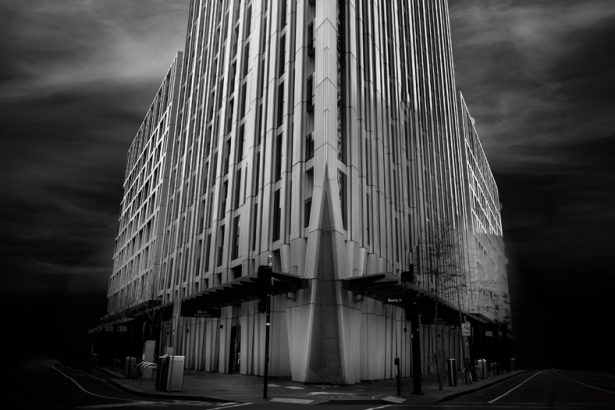
It is another free week here and I thought today I would share some photos that I took around Southbank recently. I was able to catch up with a friend and he wanted to explore all the new buildings going up the south side of the river. I have to admit I had no idea so many had been built.
As we were walking around the glass monstrosities, it was hard not to notice the reflections that you get in the glass. There is so much glass. I had to keep trying to get them. Some are obviously buildings, but there are others that are also more abstract. I like the way they give a distorted view of what is around them.
The question becomes, are they more abstract in monochrome? Or do they lose something in the translation?
Here are some of those for you to look at.


I have also done these in colour and I will show them next Sunday. Then you can decide if they are better in monochrome or colour. Let me know.
So, next week is another theme, and our host is Dawn from The Day After. She wants you to do SYMMETRY. It should be a great theme for monochrome.
Participating in Monochrome Madness
If you would like to participate in this challenge, please post photos on your blog and use the tag Monochrome-Madness, then we can all use the reader to see what you post.
You can also leave a pingback, do they still call them that? Basically, you put a link to the host’s monochrome madness post in your post, and it leaves a link in the comment section.
Don’t forget to check out the Monochrome Madness page. On this page, the next theme is announced, and there is also all the information for participating. Please go and check it out. Click on the Monochrome Madness heading in the menu.
I’m not sure I consider these as monstrosities – I like modern architecture if the buildings are interesting or striking and if they are located in an urban environment. The reflections you found here certainly fit that description! These shots work well in B&W but I’ll look forward to seeing them in colour too, for comparison. Meanwhile, unsurprisingly, I’m taking advantage of the theme-free week to share some more images of Svalbard: https://www.toonsarah-travels.blog/gallery-seeing-svalbard-in-black-and-white-part-two/
I think that is the key word here Sarah, interesting, and they often aren’t. Some are amazing, but more often than not they are just glass towers.Thank you Sarah.
hello leanne,
You have selected some wonderful and interesting pictures with reflections for this week. I particularly like the 2nd, 3rd, and 5th ones.
Many greetings, Robert
Thank you so much Robert.
My post this week could hardly be more different from yours. Not a building in sight! https://margaret21.com/2025/09/10/quiet-fog/
Very different.
The reflections are so good in Black and white! Here is mine https://wanderingteresa.com/lucerne-in-monochrome/
Thank you Teresa.
Wonderful city photos that look ever so good in monochrome Leane
Thank you so much Brian.
Scrolling through it occurred to me how our new buildings, all are poor imitations of the old. Of course I knew it, we have tight regulations since my town lives off tourism. I guess I’ve missed some of the varied architecture.
Modern architecture can be a bit hit and miss really, don’t you think? I don’t really like the imitations, I don’t mind them when they take an aspect and then turn it into something modern, but often they just miss the mark. The biggest problem here are the building regulations are so slack that the buildings don’t last. Thanks Ted.
Great reflections, Leanne – and you inspired me: https://picturesimperfectblog.com/2025/09/09/these-towers-are-main/
Thank you Elke.
Excellent reflections Leanne!
Thank you Anne.
They’re certainly very striking in monochrome. We’ll have to suspend judgment till we see the colour versions.
You won’t have to wait long Margaret. Thank you.