When I was going through my folders today I found two images of the New York skyline taken at night from the top of the Empire State Building.
I had made them black and white and then on copies added a tone to them. I’m wondering if I like the tone better or the simple black and whites. Here let me show you.
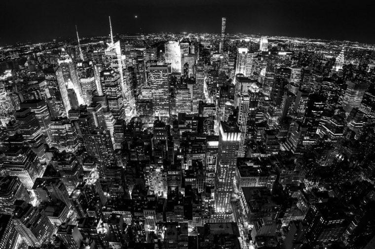
This the first one.

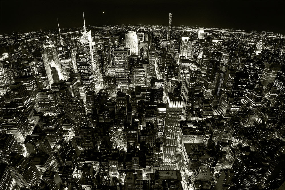
Here is the tone.
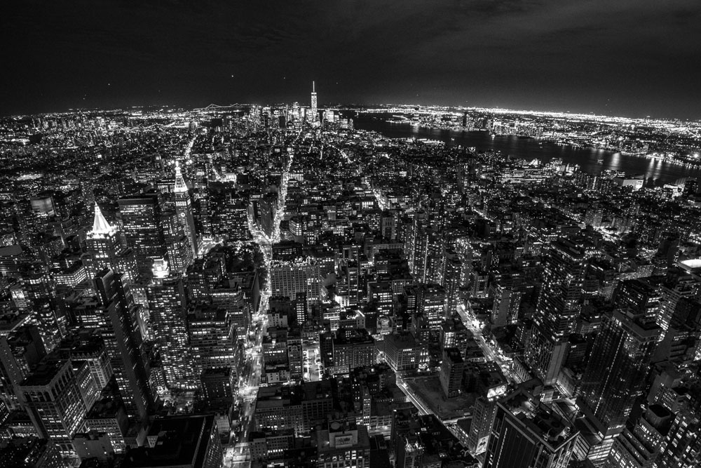
I also did this one.
Here is the toned one.
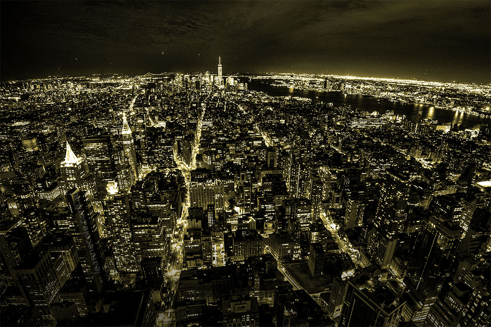
I think maybe the tone on this one was too heavy.
So which do you prefer? The ones with the tones or those without.
Here let me put them into a gallery so you can scroll through them.


Participating in Monochrome Madness
If you would like to participate in this challenge please post photos on your blog and use the tag Monochrome-Madness, as then I can use the reader to see what you post. Also, use the tag mid-week monochrome to catch Bren’s as well.
I prefer the un-toned ones, and like Leo, prefer B&W straight from camera.
Mine isn’t b&w straight from the camera, I can’t do that, lol. Thank you Tony.
Beautiful and amazing monochrome image. Thanks for this idea.Anita
Thank you so much Anita.
I enjoy playing with black and white conversions and various toning options too. Of this selection I like the black and white and the first toned version. Both pleasing to the eye. Hope all is going well on your side of the planet!! 🙂
Good to hear Judy, it is fun to do. Thank you for sharing your thoughts on them. Yes, everything is fine in my little world right now. Take care. 😀
Tones can be very alluring and are a fun experiment. They can be useful when trying to give an ‘old time’ feel to an image. I think the tone on the first shot works well although I’d personally stick to the standard B&W. The toning on the second shot is a bit too strong for my taste. I love both the original B&W’s and find the ‘curvature of the earth’ effect fun😎👍
That is very true, always interesting to see what you can do with tones. I quite like putting a tone on images, but it has to be the right one. I find the same as you, the second one is too strong for me as well. Thank you so much, I live that curvature as well.
For this cityscape shot– the first one. The tone version seems too detailed– giving more prominence to the architectural lights. This might appear better with a nature shot. Still, their both very nice photos, Leanne.
Art
Thank you Art, it is always good to hear what people thing with this as everyone seems to have different ideas.
I like the one with a bit more light. My entry here:
https://flightsofthesoul.wordpress.com/2023/05/10/poppelsdorf-schloss/
Thank you.
I like the original in the first photo and the tone looks much better in the second photo 🙂
Interesting bushboy, thank you for letting me know.
Lovely photos. I like the two b&w versions, but the lightly toned one is also appealing.
Thank you, I think I agree with you there.
Like the tone of first one, agree second is a bit heavy. Trying to think what the real colour was though.
The real colour would have been lots of bright colours I think. Maybe I should see if I can find the colour ones and show them on Sunday, what do you think? Thank you.
That would be interesting!
I will have to find them.
Hi Leanne. I like the tone on the first one… it shows more contrast for some reason. I find the second one is toned too much for my taste.
Thank you Chris, I have to admit I felt the same as you. Good to see we agree.
With the tone as shown for the first image. I think it adds a lot of visual texture. Great post, Leanne.
Thank you Babsje, good to hear.
I’m not sure if this is helpful but I like the first photo better without the tone and the second with! Great photos, both of them.
Interesting, it isn’t about being helpful, I just like hearing what people like. Thank you for letting me.
I like the one without the tone. Thought it had better clarity, but I’m looking at them on an iPhone.
Fair enough Ken, thank you for letting me know.
Hi Leanne – Hope you’re well!
I usually prefer black and whites straight out of the camera but I like your toned images better for some inexplicable reason 😉 in this series…
thanks
Thanks Leo, I am well.
I wonder if the tones are like what colours lights at night can be, no idea. Thank you for letting me know Leo.
It’s always a matter of personal taste. I quite like the 2nd one (first toned one) but couldn’t tell you why I prefer it.
I agree it is a matter of taste. Fair enough Ceci, and I don’t mind that you don’t know why. Thank you.
Without, and I especially like that first one.
FAir enough Dawn, thank you.
I like the seconds one!
great, thank you Anne.