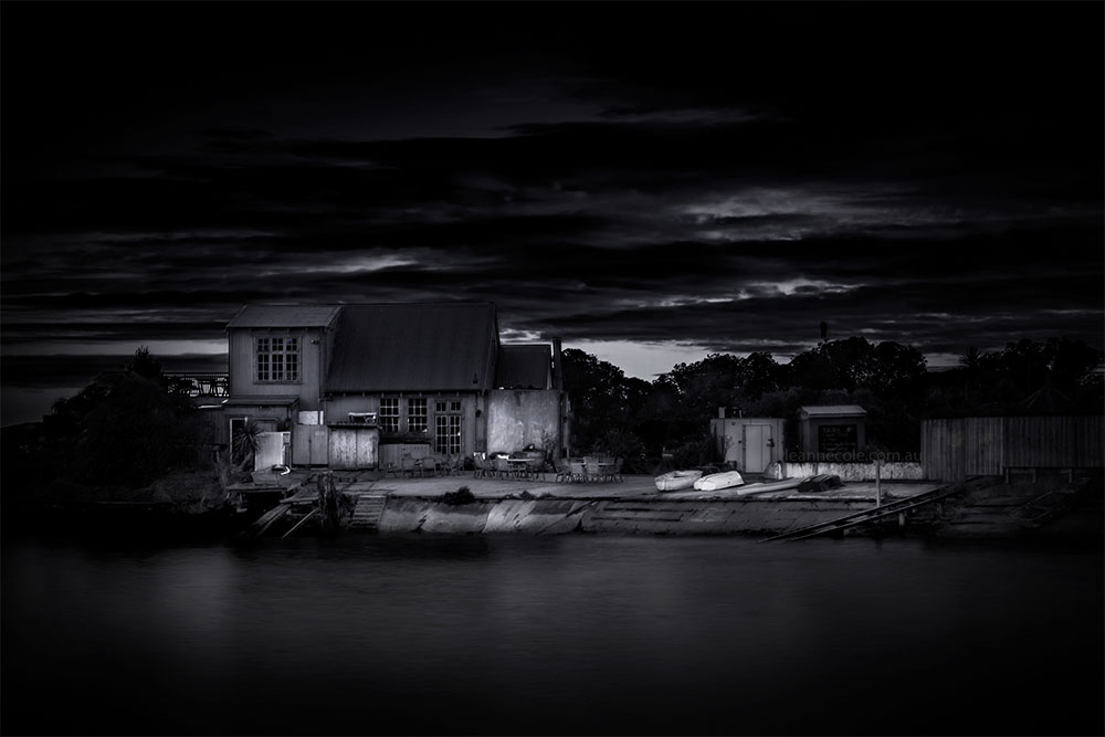
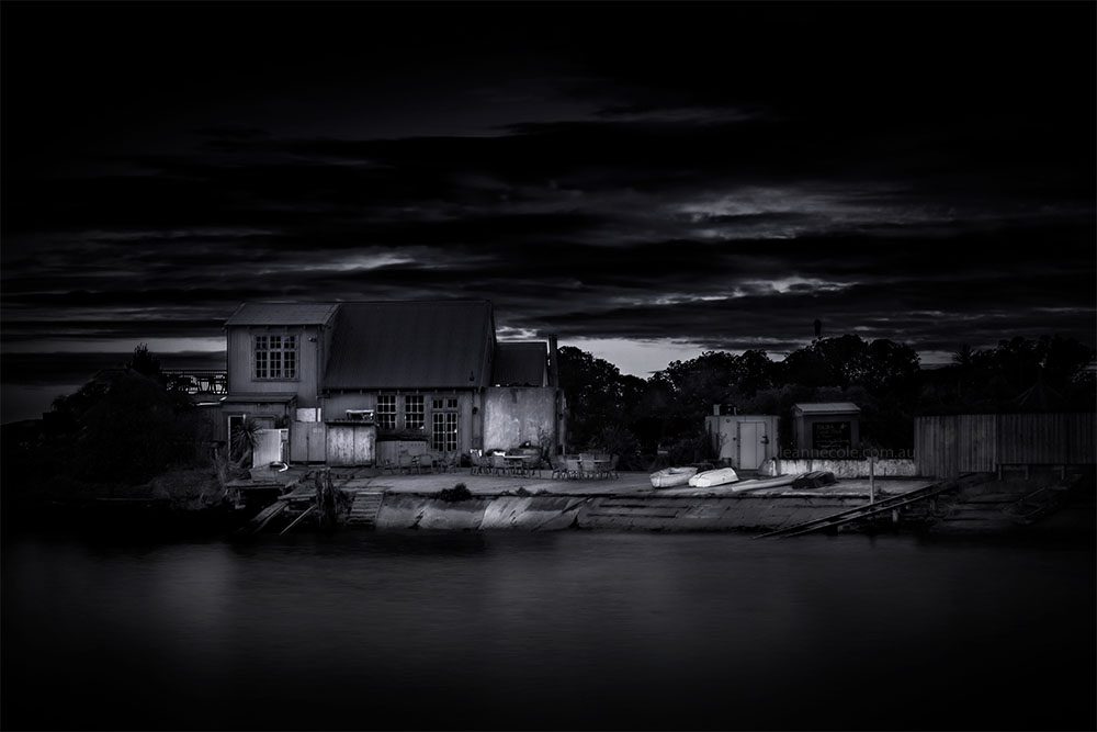
It is back to New Zealand for Monochrome Wednesday to look at buildings without colour. It is one that I originally did with the colour, but I thought it might look better in black and white.
Monochrome Wednesday – Buildings without colour
This image was taken at Moeraki near where we were staying. It is Fleur’s restaurant and apparently it is quite famous. We didn’t go there as it serves seafood and I’m a vegetarian. The friend I was travelling with doesn’t like seafood, so no point.
It is an unusual building to be one, it looks like a heap of old boat sheds. I’m sure that is the point, but it is also a great subject for photography. So interesting and so many different textures. I was standing on the side just around from it. There is a pier that goes out to the end on the left, but you can’t get out there.
The colour version
Initially, I did this as a colour image. Part of the reason for that was because it was taken at sunrise. I was never really happy with it. I didn’t like the colours. The other day I was looking through some photos from Moeraki and saw this one again.
Originally I was just going to remove some of the colour, but then thought what will it look like in black and white. I like how it turned out. If you ask me this is so much better than the colour one. When you have lots of textures like this monochrome can often be the better choice.
If you want to see the colour one, click here.
This image is a long exposure, taken with the Fujifilm X-T3 and XF 18-135mm lens. I was using my Formatt Hitech filters, 10 stop and 0.9 soft grad. The camera was supported by my 3 Legged Thing, Billy tripod.
Joining in
It would be great if you would like to participate, especially if you are enjoying the monochrome challenge again. If you want to contribute there is a Facebook group, TPM Photos which you can join and share your images. Of course, if you are blogging no reason why you can’t post your own. I like this challenge and it is nice to be thinking in monochrome again.

Intense shot, stunning!
Thank you.
This is lovely in monochrome. Your photos always are so stunning!
Thank you, that is really nice of you to say.
The sky is amazing in the color version, but the B&W seems more dramatic somehow.
Yeah, I think I would have to agree, thank you.
The color image is pretty but I was looking more at the sky than the building. But this B&W…I’m noticing all the small details of this fascinating building. Nice, Leanne!
Great observations Lois, I always love hearing what people think, thank you. I think I feel the same.