Here is another repost of the original challenge from 2014.
It is week 2 of the challenge One Image 4 Ways and I am looking forward to seeing what I come up with each week for it.
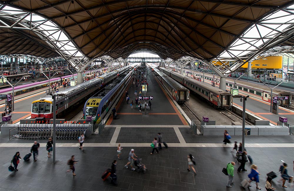
Let’s start with the original image.
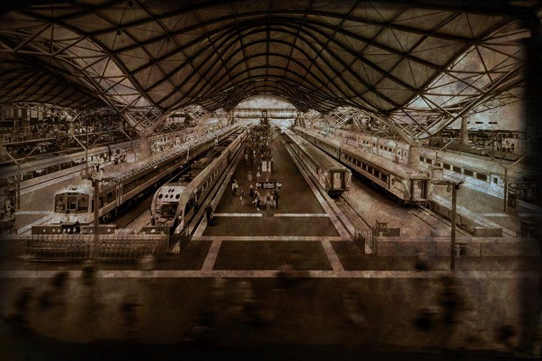
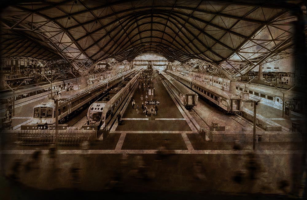
This week I tried to give the image a vintage feel. I have made it sepia and put some textures over the top. It hasn’t all worked out the way I had hoped but I don’t mind it. I love textures and like the way they can transform an image. Though they have to be used sparingly, not good to use them too much. They are great for making images look vintage.
Let’s take a look at the before and after.
I will now put them all together in a gallery.


Those look so cool !!! I love editing photos
Thank you, I love doing that too.
That’s great John, thank you so much. 😀
😊😊😁😁
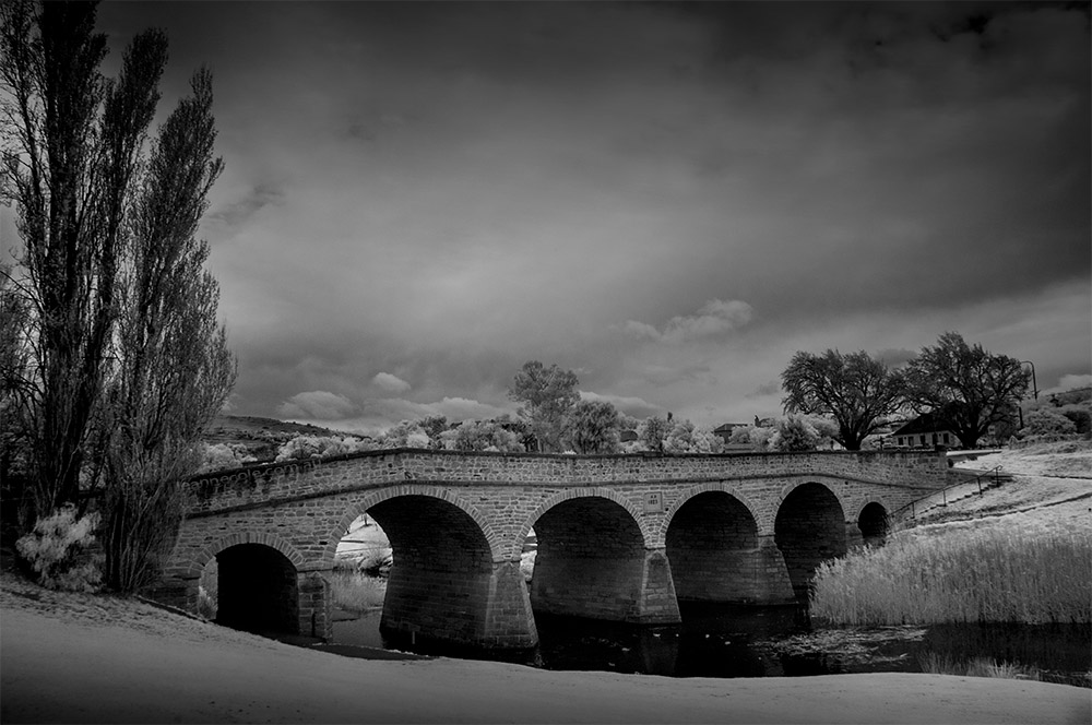
Absolutely love your monochrome version on this one Leanne.
Thank you so much Tina, that is good to hear.
I still like the original image best. Talk about crisp and clear! It’s a beauty, Leanne.
Oh dear, that is always the fear, that I can’t improve the images. Oh well, thank you Lois.
Leanne, I am always amazed and impressed with the magic you do with your photos. But this original–I just love it. And people!!! 😆
That’s okay Lois, I know we all have different tastes, I don’t take it personally, well not much, lol. I’m glad you love it, but I hope I can change you mind eventually, I guess we will see.
In this case, although I often love a vintage look, I think this is your least successful image here, because the trains themselves are assertively modern. For me, the more colourful versions are more successful.
Fair point, though it is just one week of the challenge, we will see what you think of the next two. Thank you Margaret.
what a cool station and I do like the vintage vibe of the new one
It is a cool station, though it is hard to photograph at times. That’s great Beth, thank you, glad you like it.