Here we are at week 2 of our One Image 4 Ways challenge. At this stage it doesn’t seem as hard, but the next couple of weeks will be interesting.
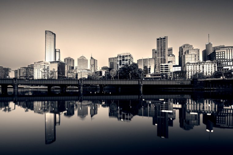
It seemed like a natural progression to do a monochrome image.
Let’s look at the original image.
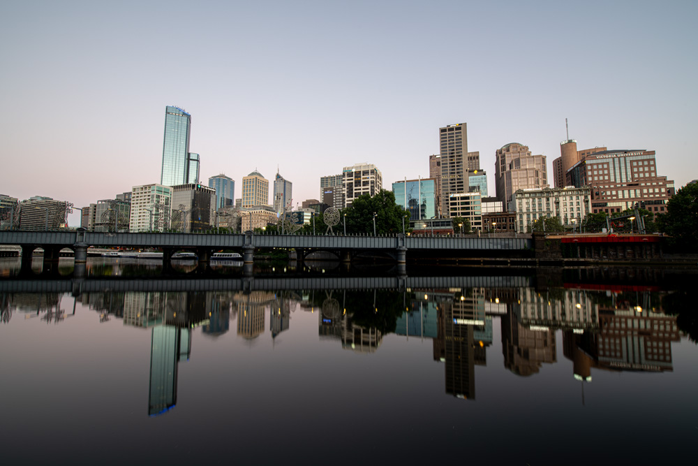
If you remember last week this was the original image that I decided to use for this challenge. Last week I just did some basic editing and straightening. That seemed like a good way to start this challenge.
I decided that for week 2 I would do a monochrome image. It seemed like a good idea and I imagine anytime you do a challenge like this one week will always be monochrome.
I didn’t really like the straight black and white version and in the end I put a tone over the top. I still wasn’t happy so I did some split toning as well. I think that made it a better photo. Maybe this is just one of those images that will always look better in colour. I don’t know, what do you think?
I don’t mind the final result, but I think for monochrome to work maybe it would have been better if I had used a photo with clouds, or maybe put some there myself. Perhaps next week.
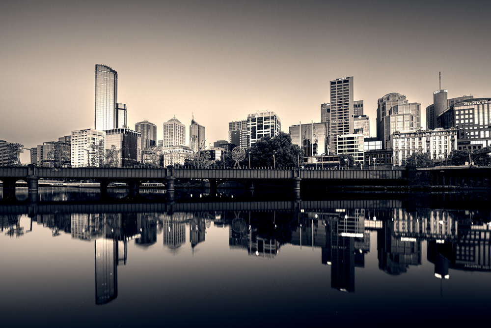
So we have two different versions of this image now.
If you would like to do this with me, then please link your posts to mine and use the tag 1image4ways so I can find them as well.
Each week you must use that basic image or the original, but what you do to it is completely up to you. As long as you can tell it was from the original image.
In the following gallery you can see the original, last week’s and this week’s photos.


Very cool image! The monochrome version gives a moody, slightly mysterious feel. It stands out in the memory for longer as something a little different that sparks the imagination and takes it outside of the photographic norm 😊
Thank you.That is an interesting way of putting how the monochrome works. 😀
Actually, I prefer the monochrome version. There is more of a sense of unity to the photograph. Held by the architectural nature of the skyline. Not an expert of course, just my opinion.
I’m not opposed to your opinion RJ. I think that makes a lot of sense. Thank you.
Love your week 2 image.
Clouds always add texture and balance to some images, but not sure about the reflections.
Thank you Vicki, the clouds would be interesting to do, as you say you would need to put them in the reflection as well.
We just like it without clouds. It looks more abstract, well it’s an artefact and shows it.
All the best
The Fab Four of Cley
🙂 🙂 🙂 🙂
Fair enough, thank you.
I think this cityscape looks good in b/w.
Thank you Margaret, good to hear.
I like the monochrome image better. The buildings stand out more.
That’s interesting Anne, thank you.
I do like the color. The blue/green on the windows adds a nice spark of color amidst all the brown tones of the buildings. The reflections are beautiful!
I agree, I like that too Lois. Thank you Lois, the reflection was great that day.