Recently I got to go to a place in country Victoria to explore and while we were there we saw an old railway bridge. The bridge is no longer in use. The area was made into a reservoir and I guess the bridge was too low. Close by there is another railway bridge, but it is much higher.
Something I’ve been doing a lot when I process images is to immediately change them into black and white. I then work on the image as though it will be a black and white image.

I don’t have a problem with how it looks in black and white. I tried to bring out the brick pylons that were left from the bridge, or what would have held up all the rails, which have been removed. I also did a bit of work in the sky to make it look more stormy.
Then, as I’ve done many times I reversed the process and made it colour again.

Sometimes when you convert it back you can find it looks revolting as the colours are too saturated, or they are changed too much. The bottom half of this image was fine, and I like the colours, but the blues and aquas/cyans in the sky were over saturated. It didn’t take much to pull them down a bit so the sky looked stormy again and not a colour mess.
I was going to leave it there, but then I decided to go back to the black and white image and add a slight tone to it.

I like the warmth of it, but I don’t think this is my favourite version of the image. It does give it another element, but I worry that maybe there is a lack of contrast in it. So I decided to add some more and see how it looked.

I guess the test now is whether or not you can see any difference. I think there is.
It is fun to try one image and do different processes to it. Each person will have there own ideas of which ones work and which don’t. I like them all, but I think I might like the colour more, but that is me.
I am going to put them in a gallery for you so you can see them better. You can click on the images for a bigger view.
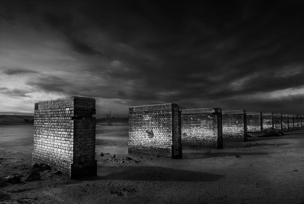


I like the colour version, though I think I’d add a little warm tone to the clouds as they’re a little too monochrome compared to the foreground, but I really like all the versions because the composition and lighting are so strong.
Anthony
I decided to do that with the clouds as that is how I remember seeing the clouds, I tried adding some colour and then they took over, I like the bridge though and glad you like it too Anthony. Thank you.
Leanne, you will never cease to amaze me! This is fabulous stuff
I’m sure I could Julie, thank you.
I like the black and white but you know I would say that , did you add a global adjust or local adjust to the contrast , looks like global
When I read what you said about the colour one, I thought, mmm she hasn’t seen the black and white yet. yep it was global. I just added it all over. Thanks Chris.
Hi Leanne,
When you look at the smaller images the sky doesn’t look quite so overpowering in the colour version. Yet in the larger versions I prefer the final image as the clouds are not so overpowering. Great image. I just love the brick work textures.
I love the clouds, I did a lot of work on them, I wanted that image because of them, I like that foreboding feeling, the idea that it is really is over. Thank you.