Here is another post where I am redoing a past photo. This is my attempt at seeing how I would do an image now compared to back then.
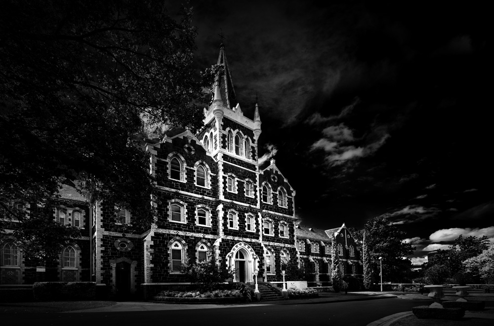
Over 10 years ago I used to be able to go and take photos of this amazing bluestone building that is part of Deaf Children of Australia. It is also a school, however, the school is no longer in the main building.
Back in the day, I posted lots of photos of the building, both inside and out, and the image I have chosen for today is one of those. I found one that I thought I might try doing again. There is another one I will do another time, as well.
Below is the original image as I processed it back then.
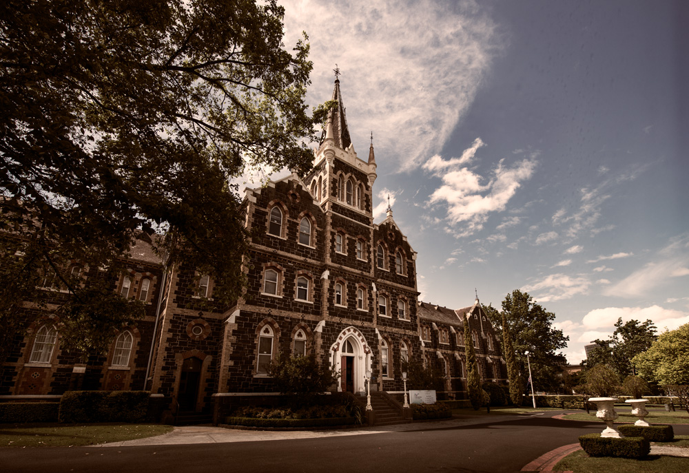
It was taken in November of 2013, and I probably showed it on my old blog around the same time.
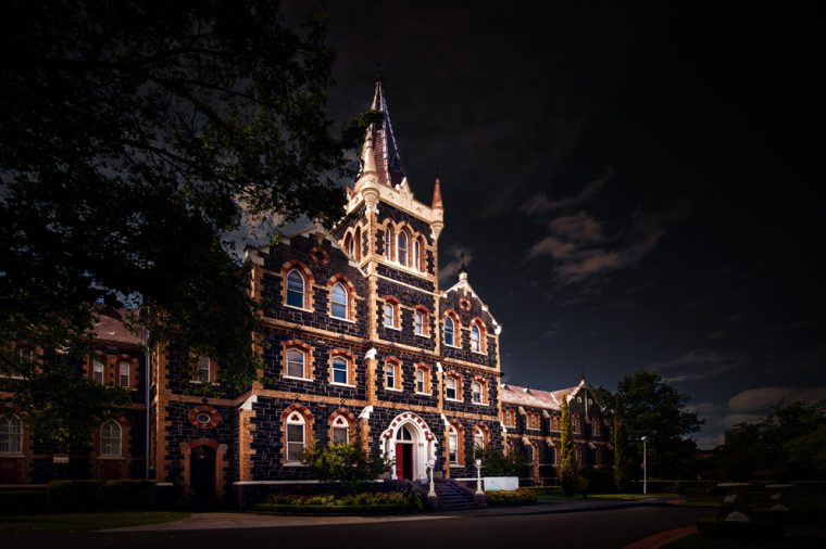
When I looked at it recently, I didn’t like how dark the front of the building was. I also didn’t like the angles on the building and thought I could straighten them up more. I was using the Nikon 14-24 mm lens, which is really wide and can do this with buildings, especially when you are taking the photos from the side like this.
The first thing I had to do was find the original RAW image. Which I did.
One of the first things I did was straighten it up. Get rid of the lean so it doesn’t look so weird. Then I worked on brightening up the front of the building more and making it the brightest part of the image.
When people look at images, their eyes always go to the brightest part, and in the original, that wasn’t the building. You can see what I did below.
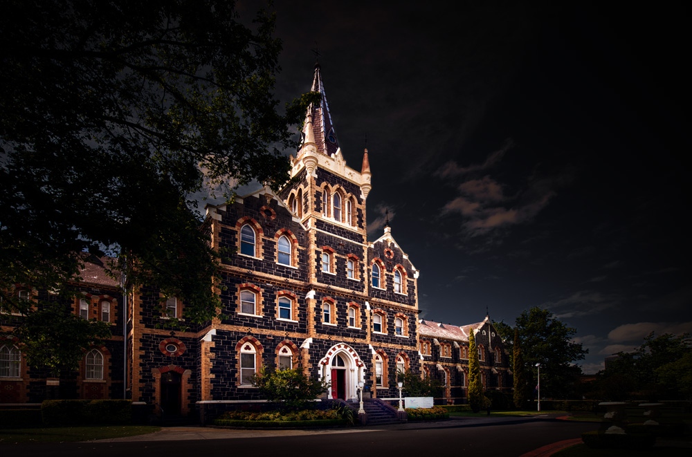
I don’t know if I love it, but I like it a lot more than the first version that I did back in 2013. I think I have learned a lot more about processing since then, and I think you can see that here.
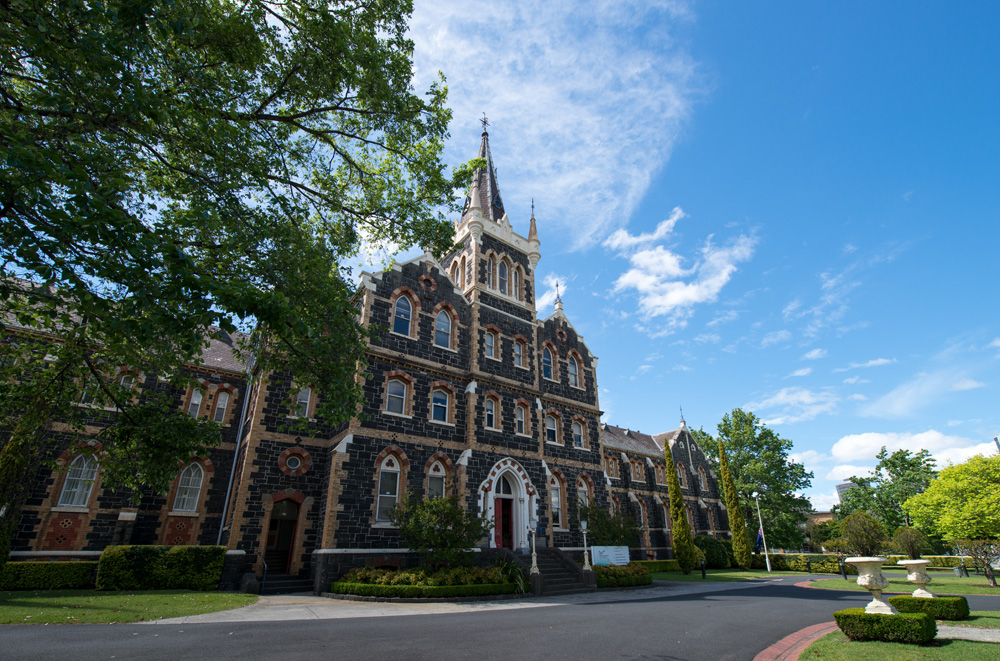
While I was at it, I thought, why not try it in black and white as well? Though to be fair, I started the colour one, and halfway through, I did the conversion. Then went back to working on the colour one.
I quite like how this one turned out as well.
I have done a before and after, but really it is more the first attempt versus the 2nd.
I am going to do a gallery of the images as well now. Let me know if you are enjoying these posts.


That’s a beautiful shot.
Thank you so much.
that is an amazing building and I do think you improved it, especially with leaning and by brightening it up a bit
Thank you so much Beth.
These posts….interesting…. please continue!
I will do my best Geoff, thank you.
It truly is a beautiful building. So Gothic in design
It is, very representative of the buildings of the time too.
For me, each treatment achieves a different purpose and pays a different “price” as a result. The reworked image is the winner for clarity, alignment and architectural detail, but in its heightened contrasts and isolation from context, the building looks like a stage-set model. The original photo has all the flaws you list, and lacks clarity, but it has quiet authenticity. Each image, I’ll argue, is the winner — in its own category.
I love making my images look like sets or stills from a movie. So thank you for that description Penny.
The “after” results are especially nice, because the lighter areas, especially around the windows, really “pop”.
Looks like you’re having fun.
Art
That is what I was trying to do Art, I wanted the building to pop. Glad you like it and yeah, I am having fun. Thank you.
Hi Leanne. I like both the original and 2025 processed photos. I’m left wondering where the light source is coming from in the 2025 edit. You taught me to check for the light source! I’m still recovering from a back injury and housebound. I haven’t been able to sit at my desktop for a couple of weeks. I can comment using my laptop.
take care,
Anne
I’m not sure I would have taught you about checking for the light source as it is something I’m always playing around with and changing. Thanks Anne.
sorry to hear about your back, back pain is horrible, I’ve been there. Take care and don’t overdo anything.
Beautiful edit!
Thank you Pamela.
I was surprised to see a bright sunny sky! I do like the brightened/straightened look of the building, though. And the darker sky lends itself so well to the photo.
I was trying to show the building more. Thank you Lois.