Really, there is an image I took on Sunday morning and since then I’ve been trying to figure what is wrong with it. I’ve tried a few things.
It does happen from time to time where I work on an image and I am not happy with it. Usually, I can work it out, but this one, I don’t know. I’m stumped.
Really, I’m just wondering if the image is just plain boring. It isn’t my usual sort of image so it has been a bit of trial and error. Who knows.
Maybe it is the composition. Maybe I just need to throw my hands up in the air say, “fail”.
Let’s face it they can’t all be good. I’m happy to admit that this one isn’t.
The Manchester Unity Building
I’ve taken so many photos of this building over the years. It is a prominent building in Melbourne and stands very tall across the road from the Melbourne Town Hall. It is one of the best art deco buildings Melbourne has. In many ways it is a shame that it is run by private companies so you can’t just wander in and take a look around.
Anyway, this is my failed attempt. There may be a time when I go back and try again, but there you have it, for now, it is time to admit failure and go onto other images.
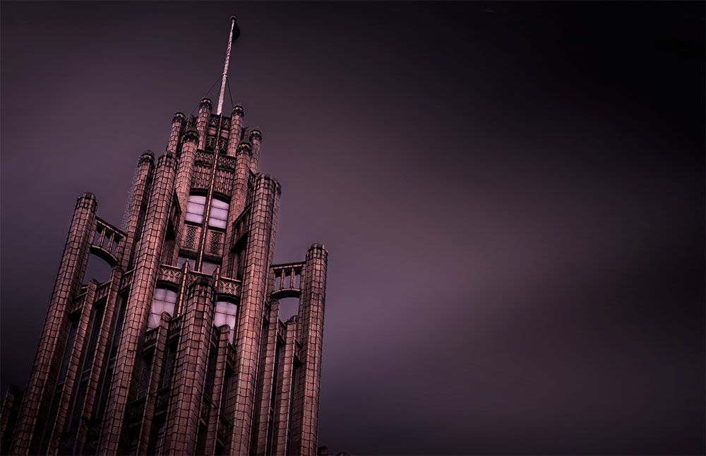

The sky doesn’t look real, but the building does. To me, that is the only problem.
I don’t know, a problem but it was fun experimenting, not everything can work. Thank you.
This is all subjective, of course, but I like the crop I see in my reader before I click on the post better than your actual image. My eye wants the building to be a little bit to the right in your version. I feel like the image is too evenly divided between building and not-building.
Interesting take on it David, I will have to go back and take a look. though I think the image is done. Thank you for suggestions.
To be honest, I wouldn’t choose that composition, not convinced a leaning vertical placed on the left in a landscape frame works that well, unless it went corner to corner for a really dramatic effect ! Perhaps try a different perspective, though I think you did pretty well with this https://jigsawgallery.com.au/collections/leanne-cole/products/manchester-unity-building-melbourne-vic
Well, I wouldn’t normally, but it seemed like a good idea at the time, and sometimes you just have to try things. That one you linked to is one of my favourties, I always loved that one. Thank you Melvyn.
Very interesting Building, and I can see your angsts with your photo. I feel the balance visually is to heavy to the left, bring it a bit more to the center and see if the help. I feel like with a picture like this it need a Caption on the right to balance it.
I like experimenting with composition as well as editing, but you know, sometimes it just doesn’t work. Oh well, that is the life of photography I suppose. I think it will go into the archives and lesson learned. Thank you Ronald.
The Post Processing seems excellent to me, definitely in keeping with your body of work. My immediate impression of a problem is compositionally based. I feel the slight angle works very well to create a sense of motion, power, authority, majesty and singularity. When I imagine the building strictly vertical it would be flat and boring. Where the image generates a problem in my mind is a sense of TOO much empty space to the right. I sense a contradiction of energy created by the building and it’s angle and the post processing, with so much empty space in juxtaposition; that the energy in the building is being negated by the absoluteness of the empty space. My feeling is that there needs to be at least a small counterpoint (birds, aeroplane, blimp or even cloud) to reduce (in my opinion) the overwhelming negative influence of all that empty space. That may address the “disharmony” I feel when looking at the image.
Thank you Craig for all your suggestions, but I think I might have to put this one down to a fail. I just think it is boring. It could be that it isn’t an image that is typical for me. I was trying some things and let’s just say they didn’t work. lol.
Have you tried cropping into portrait view?
I did think about it, but don’t think it would have helped, I think it is just a boring image. I think I can say that. lol
Thank you Don.
B&W sounds appropriate I just emailed you my version of this image.
Yeah, I got it and responded.
Hello Leanne, I have played with your image a bit. I guess the problem you describe may well be non-technical in nature. If you are after a moody, relatively low key, understated look, your image is already fine. Other interpretations are also possible. Perhaps a strong, ominous, even dangerous look can be tried (I did, in fact). It all depends on your intention. Give it a try again when you feel like you are in a different mood.
Thank you, I will play around with it again, maybe in a few months, or maybe I will try photographing it again. It isn’t my usual style of photo which I suspect is my problem. I don’t normally do images, or compose ones like that.
Would it have more energy if you cropped it square? Not my usual preference but sometimes it works…
Maybe, but I’m not sure the composition is the problem. I’m the same, I’m usually very careful about a square crop. Thank you.
your colours are great.
Me? I have decided to focus more on black & white
Thank you Rajiv.
I’ve been doing more of that recently too.
It’s where I started.
that’s great Rajiv.
I love it..but maybe because the angle of the building?
Thank you, I did change the angle, the original was straight up and down and I didn’t like it.
I’m sorry
You have nothing to be sorry for, really.