I think I have a problem. Yep, I know I do, and I am addicted to infrared images. I think this new camera is lighter, so it makes it easier to carry two cameras when walking around. I have found myself doing it a bit.
Sometimes I end up not taking as many infrared images, while other times I do a lot more. I love the look, and I notice that when I’m taking the photos, the normal images can seem less impactful. It got me thinking, and I thought it could be good to compare a colour image with a monochrome image. I think I have done this with flowers, but I am feeling sure that I haven’t done a comparison like this before.
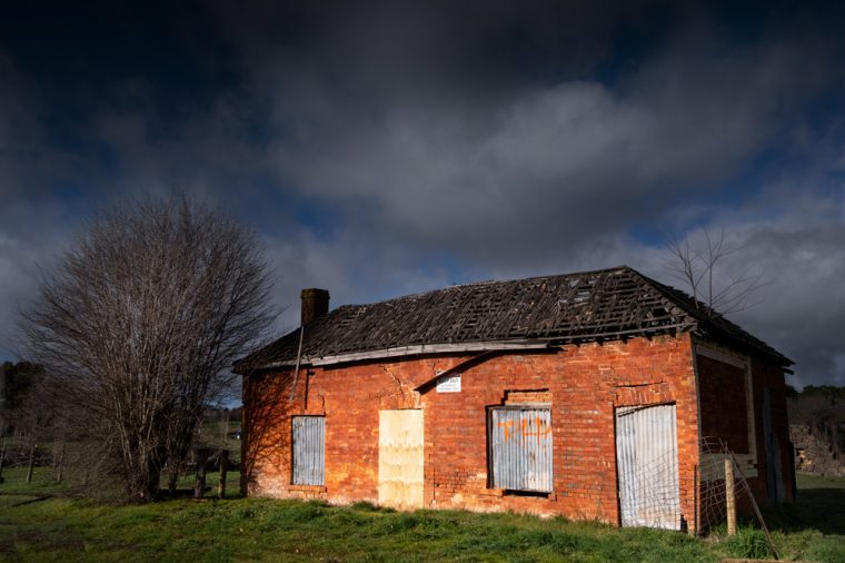
Not that long ago, I went to Castlemaine with a friend, and on the way, we stopped off in Malmsbury. I have driven past this old building so many times, but I don’t think I have taken photos of it before. I might be wrong.
When we stopped, I took out both cameras and took the same shots from different angles. I had no idea I would do a post like this at the time, but I’m glad now that I did do this.
It was a gorgeous winter day, and there were lots of clouds in the sky. The sun was shining, which I don’t usually like, but in this instance, I think it worked well.
I have the colour image first.
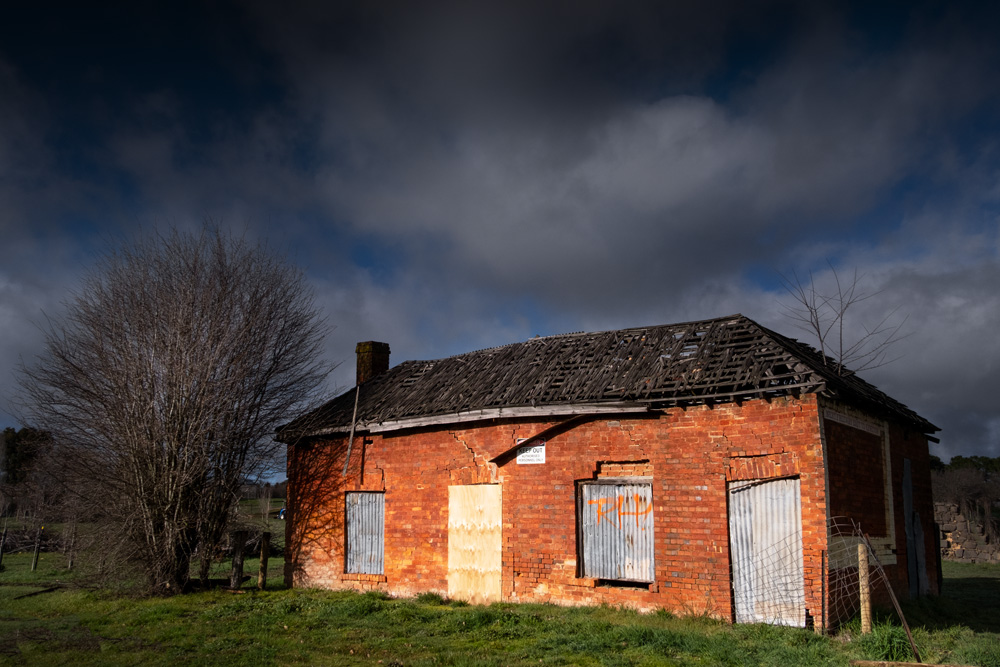
I have done some work to it, so it does look a bit brighter and there is more contrast to it now. I quite like this version of it.
As I said I also took the same building with the infrared camera.
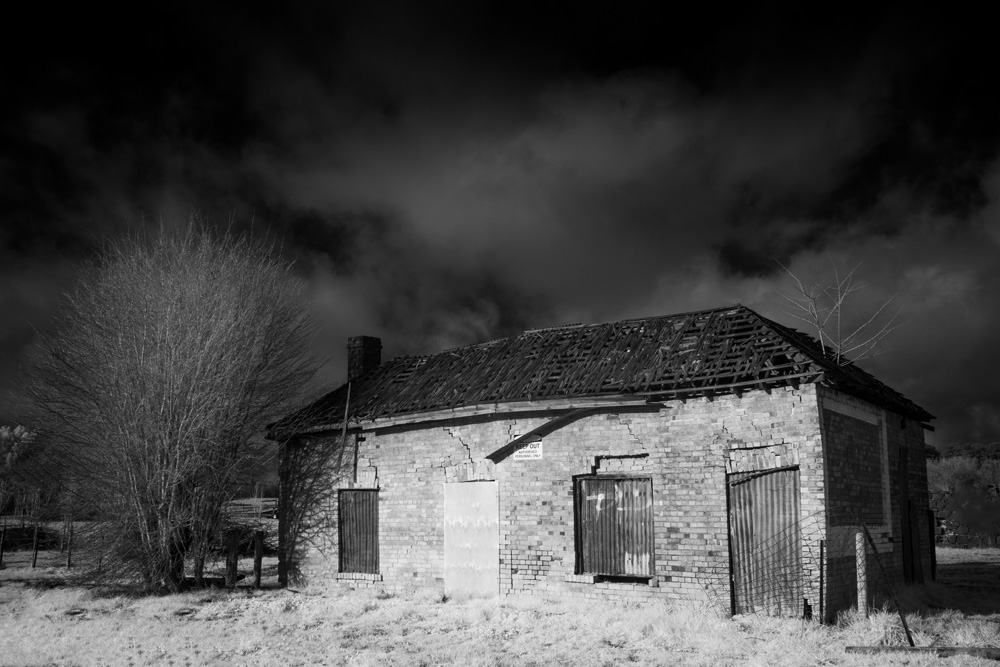
It is almost a completely different look, and it almost looks like it was taken at a different time of the year. I always love the wintery frosty look you get with infrared images.
If there is no vegetation, the images often look like normal black and white images, and at some stage, we can do those kinds of comparisons as well. Only if you are interested, that is, let me know.
I will put the images in a gallery for you to look at as well. Which one do you think works the best?


I’m a sucker for an old bordered up building! I missed this when I went to Malmsbury
I think many of us are. You will find this building on edge of the town as you enter from the freeway.
Apparently this is the Malmsbury Racecourse Hotel – 1860.
The infared is my like.
Good to hear Peter, thank you.
Both images are striking but I think I like the infrared the better of the two 🙂
That’s sounds good Sarah, thank you. 😀
I love them both! They each can tell a different story.
Thank you Donna, that’s great to hear.
I’m a b/w fan, but I love the rich colours of your first image here.
Fair enough Margaret, it’s been interesting to hear what people like.
The infrared photograph evokes a sense of a mix of mystery and melancholy.
I like that Brenda, thank you so much.
These are really nice.
Thank you Ted.
I think they work, not better or worse, but differently. Each has its own qualities, its own resonance. Either might be “better” for a specific purpose, but “worse” for another…
Thank you Penny, I love your response to this.
Wow. At first (and second) look, they don’t even look the same building. I like the color version. Though I like many infrared photos, in this instance, I’m not too fond of it. I like the experiment, though; I would be happy to see you do more like this.
You aren’t alone in liking that version Joanne, thank you Joanne, I would like to do more.
Still the color, I think – unless you give color IR a shot, that’ll flip the image into something completely different. Have a great weekend, Leanne. – Marc.
Okay Marc, the responses have been interesting. My IR camera doesn’t do the colour, sometimes wish I had got one that would. Thank you.
Hard to pick, but the infrared one speaks more to me…
Fair enough Sofia, thanks for letting me know.
I really like the color version best. It reminds me of just after a good rainstorm when the sky suddenly gets so bright with the sun shining. While I always like your infrared photos, I think this one is a bit too washed out looking. A lot of the brick detail is gone. It definitly gives an entirely different look to this building, though.
I love that light of just after a storm when the sun comes out, it is stunning. Thank you Lois for your thoughts.
Good question Leanne. I think that while the color image shows an old brick building, the infrared image shows more depth and feeling. It does looks like a winter scene, but the building looks older and has more personality.
Thank you Anne, good to hear what you thought. I wasn’t sure.