When I first saw that the challenge this week was abstract, I considered not doing it. I like abstract images, but they aren’t something I do much.
Our host this week is Ritva from Ritva Sillanmäki Photography and she chose Abstract. I would encourage everyone to go to her post to see what she had to say about it.
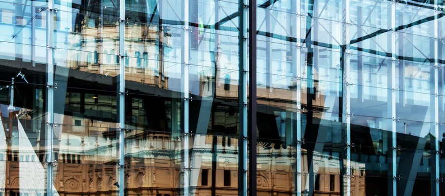
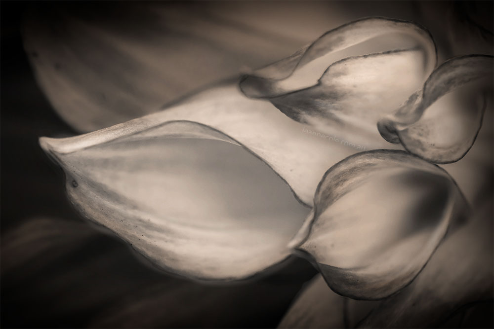
I like to make my own interpretations, though not sure mine is the same. I think of abstract photography images as ones that are distorted and you really have to look to see what they are.
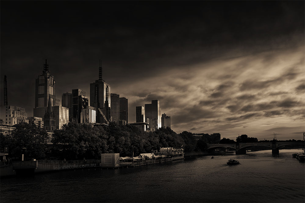
As I said I don’t have many of these, but I have tried to find some. It is interesting to note that nearly all my abstract images have been done in black and white or monochrome. I think it is because when you take the colour out it makes it harder to work out what it is. Do you agree?
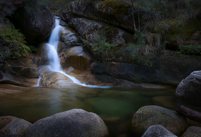
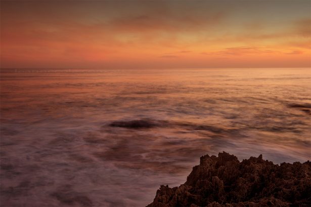
So here are a few images that I hope fit the brief. They were all taken in Melbourne.
Thank you Ritva for the thought provoking challenge and for being out host this week.
Maybe you would like to participate this week, it is a great challenge to do. To find out how to join the Lens-Artists Challenge, click here for more info.


I am glad you joined in. I am a big fan of your architectural photography, and it’s fun to see your interpretation for this challenge. My favorite is the long exposure blurring the people walking by.
Thank you John, that is a good one, I am enjoying the challenge and it is nice to be able to participate.
GREAT selections. Excellent.
Thank you John.
the 26 and steve city one stood out to me from these beautiful city images. City rain abstract . They are all beautifully composed and sharp images and still deliver the abstract feel to them- I wouldn’t expect anything else from you
Thank you Ritva. Good to hear which ones you liked. it was a challenge for me, that is for sure, so thank you for setting it.
You mastered it …
Thanks Ritva.
Thank you John, I wish that were true, but there are things I think I’m not good at.
For someone who wasn’t keen, these are great Leanne 😀
Thank you Brian, interesting challenge.
I liked your images and experimentations with abstracts. Beautiful photos, Leanne.
Thank you Egidio.
Leanne. I love your choices, and I agree. the monochrome images encourage us to look a little closer to discover what we are seeing. Yes, I think you brought abstract to light for us. It WAS a great challenge.
Thank you Donna. Good to hear you agree with me, and think the same. It WAS a very good challenge.
You’ve definitely “fit the brief” Leanne – and as always your images are wonderful. I especially loved the header.
Thank you Tina, that is good to hear. I love that image too.
I think you’ve done incredibly well, especially with your architectural ones, glass and reflections worked amazingly.
Thank you Sofia, I have to agree, I love what reflections in glass do.
Love these images Leanne. Some are more naturally more abstract than others. All are great.
Thank you Anne, it was a challenge and I agree with you some more so than others.
love the effect
Thank you Beth.