It’s late, I’m sorry, but I’ve been away trying to get my image for this months theme, Movement. Finally got an image for it, so I’m feeling very relieved. Once again there have been some great interpretations of the theme. I’m sure you will enjoy them.
The theme for September is going to be Roads. It will be the first week of September.
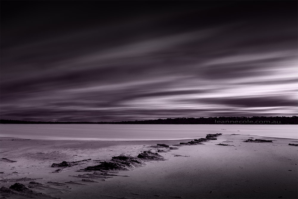
I was at the Pink Lakes the other day and the clouds were moving fast, and the wind was making the water choppy. I thought it would be good to try a long exposure. I used the old rotten wood of the ramp to lead you into the image. I did do it as a straight black and white, but since it was the pink lakes, I thought a pink tone might help.
Don’t forget all the instructions on how to enter your own images are at the bottom of the post. If you have entered an image then please remember to check your image in the gallery, scroll down and see if anyone has left you any comments.
Monochrome Madness each week and if you wish to participate and submit an image here is how you do it:-
- You must email me the image you want to include and if you have a blog or website, or somewhere else, please include the link. My email address is leanne@leannecole.com.au
- The image size should be low res, so the largest side should be 1000 pixels or less.
- Please insert either your name or your blogs name in the file name.
- Remember I am on Australian time, so with GMT I am +11 hours at the moment, I publish my post on Thursday morning.
- If you need more help with sending images, and get confused about time zones, etc, well, there is a great website called The World Clock, if you go to that and look at Melbourne time, if it’s before 6pm on Tuesday evening, then you can still send me images. If it’s after that time, you can send me an image, but it will be set aside for the following week.
- Remember to include a link to your blog or website.
- Please remember to resize your images, it is fairly simply, you just need to go into any editing software and usually under Image you will find, resize, scale, or image size, something like that and you can resize your image there. Change the dimensions to pixels and make the longest side 1000 pixels or smaller, hit return, and for most types of software that should change the other side automatically as well. Just remember to save it with a different name so you know it is the smaller version. If you have any problems, please contact me, I don’t mind helping out.
Please note you don’t have to be a WordPress blogger to be in this challenge, you can have a link to a Facebook page, a Flickr page, anywhere really, or no link. We just want to encourage people to do monochrome images, just for the madness of it. Just to let you know also, that as soon as the challenge is published, all emails and images you have sent me are deleted from my computer.
Oh, wow. It’s seems it’s been a while since I stopped by and the quality of images seems to be better than ever. Well done, Leanne, for sustaining this challenge. Will definitely try to get organised – I wanna be part of this. Fantastic.
they certainly have Maxine, it is great to see the great quality of images. Thanks, though it hasn’t been too hard, mostly. It is nice that it stayed small, I like that. Well, you better send in your image for next week.
Some excellent photos there!
There certainly are.
Yes….
I have loads of photos for ‘Road’.. Lets see
That’s good, a head start.
Yeah… I don’t want to regurgitate old photos, so now I need to figure out what I will do…
I’m sure you will work out something.
Yeah… But, I need to think…And, I am sad that matt did not win
I’m sure you will. We were too, though, Elena did win it fairly, she did do a much better job on the day.
I agree, sadly…
😐
a really ‘moving’ collection. great! My top 5 are: 1, 4, 6, 23 + 35
I’m sure those people will be very happy.
🙂
I can only agree with the above comments, Do the images have to be taken within a certain time frame or can we draw them from our photo libraries?
No Ron, it is completely up to you for these. I’ve used photos that I took years ago, though most are fairly recent ones.
🙂 Lots of entries! And very interesting to see how everyone approached the subject, so much variety 🙂 Very lovely collection.. and BOOM! 🙂
It is, isn’t it, quite amazing to see what everyone else has done.
Wow, these are great! I particularly like the ‘people’ movement images. Intriguing. A great gallery for the theme 🙂
That’s great to hear Robyn.
They are all intriguing. I do love the double exposure effects of 2, 9, and 11. Thanks for the creative theme, Leanne.
You’re welcome
What a fantastic theme, Leanne. The photos are exceptional!
It has been Lois, and I agree, totally.