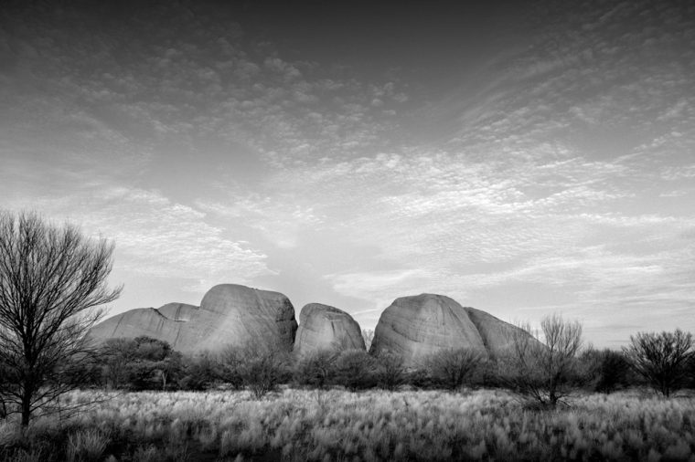
Of course the red rocks I’m talking about are the Kata Tjuta and Uluru. They are very famously red. You typically see images like these in colour so you can see the gorgeous colours.
It got me thinking, what if I did them in black and white, would it stop them from looking amazing?
I decided to use ON1 for these and the B&W Modern presets. They were all done with only two of them. It seems it can be really hard to find just one preset that will work for all the images. I don’t know that I think these all worked, but it was an interesting experiment. Converting images doesn’t always work as well you hope. I suppose it is something you really don’t know if it will work until you try the conversion.
I’m also not sure I picked the right presets, as they seem good for some but not others. It is all an experiment at the end of the day to see what works and what doesn’t.
Here is a gallery of the images I tried.


Our next host is Margaret from Pyrenees to Pennines and she has chosen the theme COLOUR MONOCHROME. I think that is images that have one colour other than black and white. Should be an interesting theme.
Participating in Monochrome Madness
If you would like to participate in this challenge, please post photos on your blog and use the tag Monochrome-Madness, then we can all use the reader to see what you post.
You can also leave a pingback, do they still call them that? Basically, you put a link to the host’s monochrome madness post in your post, and it leaves a link in the comment section.
Don’t forget to check out the Monochrome Madness page. On this page, the next theme is announced and there is also all the information for participating. Please go and check it out. Click on the Monochrome Madness heading in the menu.
Shot 1: you are given a glimps of Kata Tjuta/Uluru as it may have been c500 million years ago, under the sea. The clouds mimic the waves above so well, some shot.
Speaking only for myself, colour would not have revealed this to me.
I love what you have said Geoff, great observation, thank you so much for sharing it with me.
I second Jane Lurie’s comment. We fall into those fiery reds, mesmerized. Your B&Ws help us see the majesty of the rocks themselves.
Thank you Penny and I love your description.
These rocks are stunning! Magnificent in BNW!
Thank you Amy.
These do work very well in monochrome as it brings out the textures and patterns of light and shade. I like the pure black and white better than the darker tinted ones I think, because of the greater contrasts 🙂
Thank you Sarah, that is good to hear. Interesting which ones you like the best, thanks for letting me know.
Love these monochromes, Leanne. I’ve visited these places and the reds are so intense, but it works so well in black and white.
I wasn’t sure, but glad to hear you like them Jane, thank you.
It is interesting how things change when going to B & W. Some enhanced and some are not!
Most definitely Marland, one of the things I like about this challenge. Thank you.
Very nice 👌
Thank you.
Rocks respond so well to monochrome treatment. A nice interesting selection. Thanks for previewig me next week!
Thank you Margaret, they are great for monochrome and you are welcome.
Back again. I did a copy as I liked the idea of rocks only mine are smaller
https://bushboy.blog/2025/07/16/this-post-rocks-in-monochrome/
Oooh I look forward to seeing what you posted.
I love this!! Absolutely beautiful!
That’s great, thank you Braden.
So good Leanne. Rocks do come out well in monochrome especially Kata Tjuta
Thank you Brian, I wasn’t sure about these.
https://wanderingteresa.com/london-in-monochrome/
You never know what the photos will look like after they’re converted to black and white!
That is very true Esther, you never know.
Nice ones Leanne. I think I like the Kata Tjuta more than the Uluru in monochrome.
Interesting PR, thanks for your thoughts.
The rock itself is certainly impressive just through it’s form, rising from surrounding flatlands. But I feel it lacks its uniqueness, the instantly recognisable feature. I’ve tried to treat our local stones similarly and the result I find are okay but not quite satisfying: https://picturesimperfectblog.com/2025/07/15/quartz-porphyry-quarry/
You could be right Elke, thank you.
I have seen lots of pics of those famous rocks in red, they definitely look different in mono
They do Beth, I think they look different.
The monochrome treatments still showed the beauty in those rocks.
Thank you Egidio, good to hear.
I like the true black and white/high contrast conversion the best. Of course the rock is amazing in color.
Fair enough Anne, and I agree, I wasn’t sure about removing the colour.