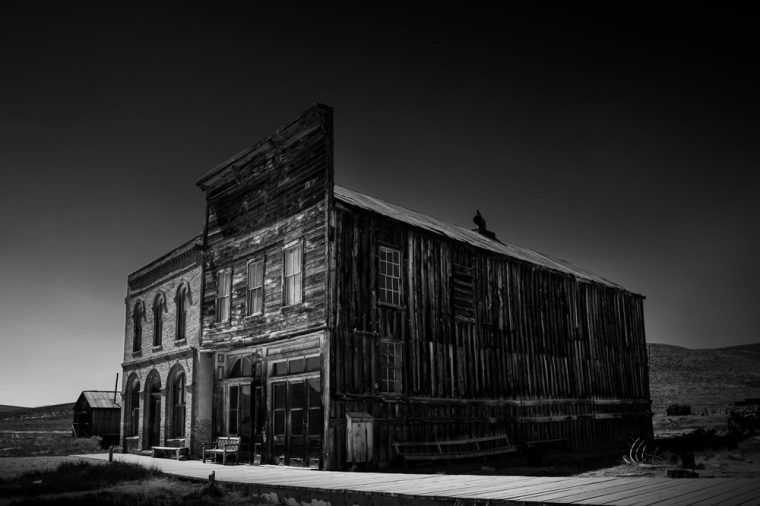
I have been seeing lots of photos on blogs that are black and white and of old buildings that have just been left. It made me think about my time from Bodie, the ghost town in California. I was lucky to be able to visit it back in 2015.
I have always been disappointed in my photos from there because of the weather conditions. It was a very warm day and the sky was so blue. The sun was creating harsh shadows, and I’ve never known quite what to do with the photos.
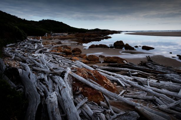
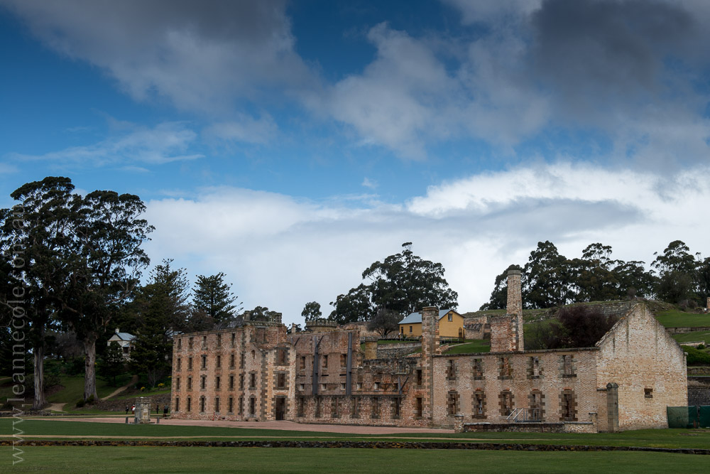
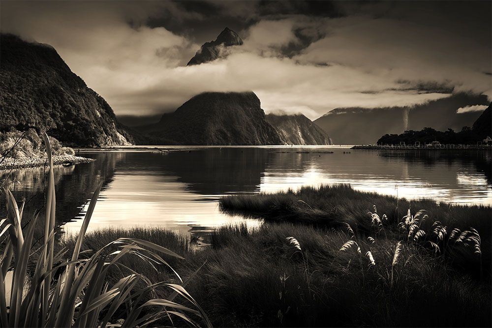
After seeing some images that seemed to be taken in the same conditions, it got me thinking, would my images looks better in black and white than colour?
I went through my folder of images and tried to pick a couple, but there were so many. I might have to do a follow up post some time.
I wonder if it is because they are old buildings and we think of monochrome as being old? I really don’t know. I would love to hear your thoughts. I have to admit I have not liked my colour images, but I think I might like these. Do you think subjects like this work well in monochrome?
Participating in Monochrome Madness
If you would like to participate in this challenge please post photos on your blog and use the tag Monochrome-Madness, as then I can use the reader to see what you post.



Gorgeous!
Thank you Dawn.
The photos feel almost eerie with the directional light. I like them and the sense of mood they create.
Thank you Donna, that light was very bright sunlight. I’m glad you like them.
The pictures is beautiful in silence of monochrome 😃
Thank you. 😀
The photographs are amazing in monochrome! Exudes the feeling of abandonment very well. Particularly liked the picture of the interior with chairs, very well done!
Thank you so much.
👌🏻📷👍🏻. 👏🏻👏🏻👏🏻👏🏻👏🏻👏🏻👏🏻👏🏻
Thank you.
Amazing black & white.
Thank you Valent.
Old… new… color… black and white: there are conditions that satisfy any of these elements. It’s nice to experiment with all of them.
Art
You got it Art, it is all about experimenting and seeing what works for what. I am never a this or that and hope I try different things. Thank you Art.
I think the fact that they are in black and white does add to the sense of them being old but also neglected. It creates a sort of moodiness. Perhaps it is because it reminds me of old photographs of the Victorian era.
They are good obsevations RJ, I especially like the last one, and I think that is so true. Thank you.
I’ve read somewhere that people used to dream occasionally in black and white. These observations happened mostly in the first half of the 20th century. And all types of meaning were attached to these b&w dreams. And then movies were shot in colour, TV turned colour, and photography became predominantly colour photography. And people stopped dreaming in black and white. So I think that our perception of b&w = old has a lot to do with reproductive medium. When I think of the middle ages (paintings rather than buildings) I most certainly think colour rather than monochrome.
Re: the preference of b&w movies over colour movies – it’s obvious that the b&w movies were shot in that medium, with b&w in mind by the director and the cinematographer, so it’s no contest.
So here is mine in “bandicoot” (that’s the colour not the animal): https://picturesimperfectblog.wordpress.com/2023/10/11/does-chlodwigs-ghost-still-dwell-here/
That is interesting about dreaming, I don’t think I really think I think about whether I dream in colour or not. Thank you for sharing that. I guess old images like this from a 100 or so years ago we do think of as being monochrome, maybe. I don’t know. I just think the photos worked better in black and white.
I agree about the movies, totally. Thank you Elke.
Some subjects just lend themselves to monochrome, and sometimes it’s the composition.
That is so true, very true.
I love the moodiness of these shots. The colour versions must look very different and convey a brighter but much less interesting atmosphere. And yes, the age of the buildings suits monochrome too.
Here’s my offering for this week: https://www.toonsarah-travels.blog/gallery-seeing-chicago-in-black-and-white/
Thank you Sarah, the colour versions do look very different, so different I don’t like them that much. Good to hear your thoughts.
PS Your old buildings are ever so good 🙂
Oh thank you Brian, appreciate that.
Of course old stuff is better in B&W I grew up with only B&W film in my camera, it’s all we could afford, B&W tv in fact everything was black and white. I am just glad I wasn’t bought up in the sepia era 😁
I remember B&W tv, and I remember when colour started coming in, though we didn’t get a colour tv for a few years. Thank you Brian, I get where you are coming from. I think most of my childhood photos were in B&W too. The days when colour was more expensive and now, for film anyway, it is the other way around. 😀
Black and white certainly helps to give the abandoned look more strengh. I think they work, Leanne.
I like that idea, about the strength Sofia. Thank you.
Will you accept a challenge? Good! Pick your favorite old black and white movie pop some popcorn and enjoy. Now find a colorized version. I’ll bet you find the colorized version is less enjoyable.
Shooting in black and white is an art unto itself. An art well worth masting. Here’s my latest effort. I entitled it ‘Sadness’.
https://brianwaddington.blogspot.com/2023/10/neither-pro-palestinian-nor-pro.html
PS; I was once a pastor and your church image evoked quite the response.
B
I don’t know about the challenge, I always think that colourised B&W films look weird, so different to taking a photo in colour and then converting it.
It is an art form and not always easy. That is part of the reason why monochrome madness started, because I knew that I needed to do more.
Thank you Brian.
They’d be a good accompaniment to a Halloween story!
That’s true, thank you Kevin.
I think they look great in b&w. I agree, it matches the style of photography because it’s an old, abandoned subject. In general, I think it works well because abandoned things have so much texture and that always looks great in b&w because of the contrast.
Thank you Alicia, I agree, and that is kind of what I was thinking when I saw the others. Great observations.
IMHO I think these are great! I do like the vignetting but I might pull that back a little, not a lot.
Thank you, that is great to hear. I like my vignetting, I do that all the time.
Dear Leanne
we like your BW photos. It works well with harsh light and architectural structures. You produced a spooky atmosphere.
All the best
The Fab Four of Cley
🙂 🙂 🙂 🙂
Thank you so much, I love hearing that the images are spooky.
These are great images Leanne. I visited Bodie in 1993, it was really hot weather, I struggled a bit to get good image compositions.
Thank you, sounds like the conditions you went in were basically what I had. Though it does make you realise what a horrible place it would have been to live. Especially back then.
I like these photos in B&W, Leanne. They look a little creepier…which, in this case, is great.
I like creepier, I like it a lot. Thank you Lois.
I like Bodie in black and white. Now I’ll have to go back to my photos and try it. Maybe even sepia tone. Your images show mystery, and that’s what a ghost town should be.
I think I do too Anne. I hope you do, and I look forward to seeing them. I thought about a sepia tone, but was too lazy, lol. Thank you Anne.