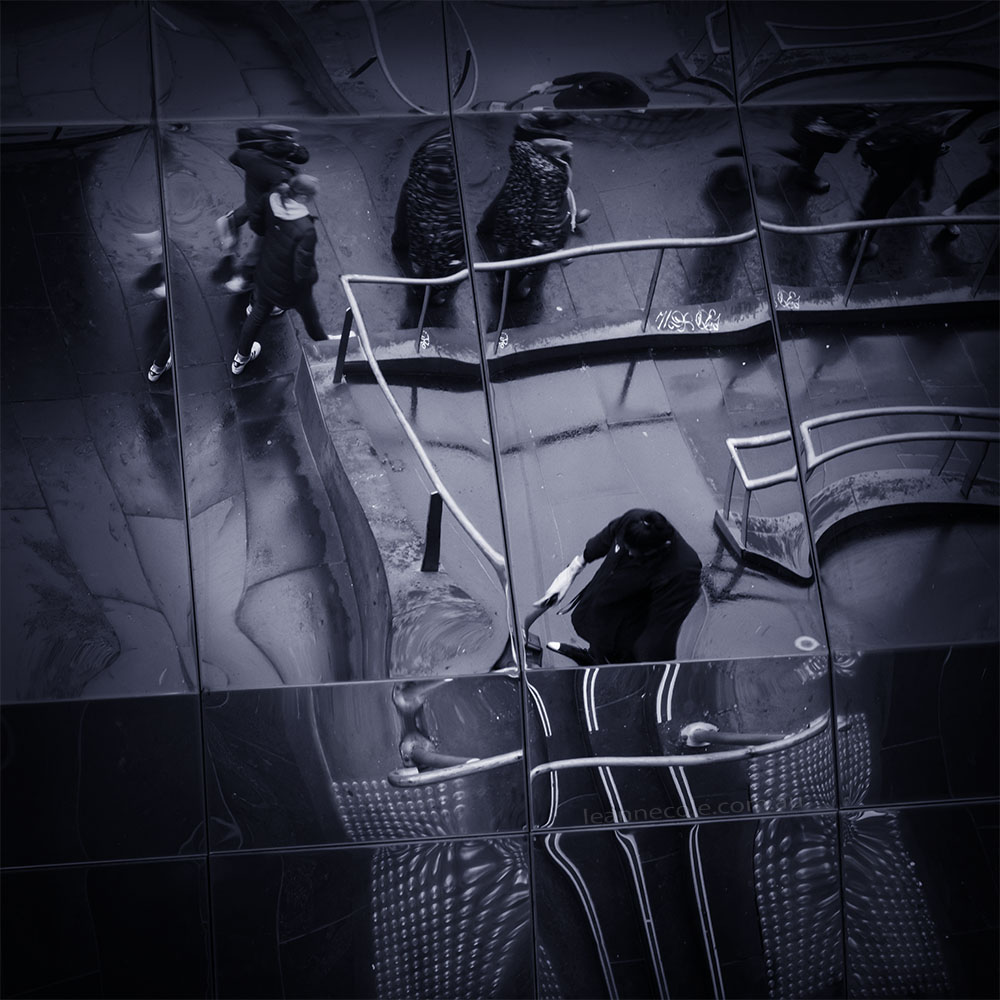
While looking through my archives for an image to do today I found one that was an abstract and it seemed like a good one to try for Monochrome Wednesday.
Monochrome Wednesday – An Abstract
This is a quick post today. I have to get ready to head out for the Melbourne International Flower and Garden Show. This image was prepared the other day for this post and then I completely forgot about doing the post. I’m still trying to work my way back into this being more regular. Perhaps I should start doing them the day before again and then scheduling, that used to work really well.
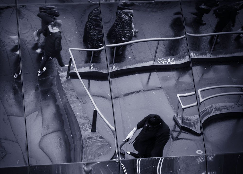
Anyway, this is an image I got one day in Melbourne when it was raining. The image was taken looking up into a mirror-like ceiling and I really liked the effect it gave.
I gave it a square crop because there was nothing on the side and it seemed almost pointless having it there. This sort of crop is different for me and I often don’t do, but sometimes it really works with the image.
A blue tone was put on it to help give it that cold rainy look. I’m not sure it worked, but there it is.
Joining in
It has been great to see that people are enjoying the monochrome challenge again. If you want to contribute there is a Facebook group, TPM Photos which you can join and share your images. Of course, if you are blogging no reason why you can’t post your own. I like this challenge and it is nice to be thinking in monochrome again.

Love and like this abstract, Leanne. I find the “warped” reflection adds to the cold, rainy look.
O/T: I’ve relaunched my IG account. I was getting annoyed by other IG pages featuring adult content. I opted to delete the previous account and start fresh and go private for the time being. The new name is @team_krw if you’re interested.
Thank you David, glad you like the warped point of view.
Okay thanks David, I will go and search for you.
Fascinating image. Really works in monochrome.
Thank you RJ, it was almost monochrome in the original, so it seemed like a good one for it.
I find this an engaging and and yet also relaxing image. I’m unsure what the original colours would have been but for me it’s been genuinely enhanced by being monochrome. There’s an organic flow within the image, which is aided by the highlighting of the waves flowing through the shot due to the imperfections created by using a reflected image. It works wonderfully. There’s a juxtaposition of recognisably human activity with stark structural elements of the surrounding architecture. Yet it’s mysteriously rendered in an otherworldly manner aided in a great part for me at least by the choice of monochrome. Excellent.
Great description Craig, it is always nice to see what people see in my images. Thank you.
Sometimes your posts are kinda timewarpy because of where we live. Monochrome Wednesday is great but it’s still Tuesday here….
Yes, we are a head of most of the world, so it depends on where you live. Sorry, but it is Wednesday here.