Welcome back to my One Image 4 Ways challenge that I am doing each week. I did the first one last week and you can find the link to it here.
So as a reminder, this is about picking one image and then processing it in 4 different ways then presenting each one each week. It isn’t always easy and sometimes the results are not great. Picking the right image seems to be the way to go.
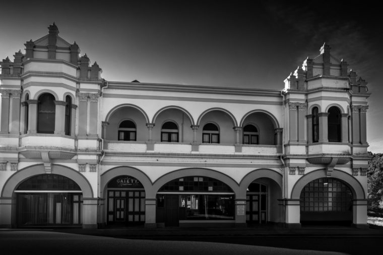
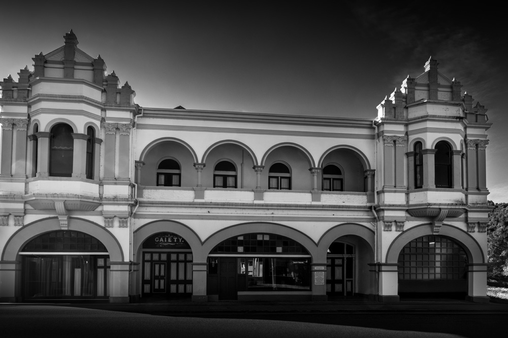
The original image I choose is this one. It was one of a theatre in the town of Zeehan in Tasmania. As I said last week, one of the things I really didn’t like were the cars parked out front. It you saw last weeks post you know I got rid of those.
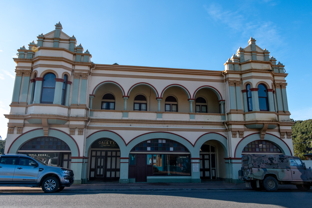
I don’t think it will come as any surprise that I decided to do week 2 in monochrome. I decided to use the original image with the cars removed and in fact I will be using that basic image for each week. I don’t see the point using the original if the one thing I really hate is the parked cars.
It is a fairly standard conversion, so it was sort of easy. However, I did add a tone to it. It was a very pale yellow one that I then blended with the soft light mode.
I don’t know if I think it is a great monochrome image, but it was worth converting to see.
This is a monochrome image because of the tone I put on it and not a black and white image.
I think next week’s image will be better, well I think it will be.
Here is a gallery of the images so far. What do you think about using the image without the cars? Is it what you would do?


For a photo of an architectural subject, I prefer, whenever possible, to capture the scene without cars, people, or anything else that distracts from the building. Of course, sometimes it’s unavoidable. However, I find the photos without cars much more appealing, whether they’re in color or black and white. If I had to choose in this case, I would prefer the monochrome version.
Yeah, I agree, I like images without cars too. The monochrome one seems very popular, glad you like it, thank you.
I think all of your photography is amazing and it leaves me downright awestruck. But your black and white work, in a different way, might be even better. Your mixing of colors has given me some new ideas to try out.
Thank you so much Marilyn, your words mean a lot. I am so glad that I was able to give you some ideas. wonderful.
Thank you John. Actually it is a monchrome image because it has a tone over it, it is a pale yellow tone. 😀
😊😁☺️
That is such a cool theater building
I think so too Beth, thank you.
Having seen your photo last week I decided to paint, the Gaeity theatre, have nearly finished.
I hope you will send me a link so I can see it Rich, thank you.
Here you go: https://rich1698.wordpress.com/2024/09/16/gaeity-theatre/
Thank you Rich, lots of great information there, I might put a link to it in my next post about the theatre.
Very nice. Car removal was the way to go!
Thank you, and glad you agree with me.
I like the color photo only because that is the prettiest shade of blue the building is painted. Very cool building, too!
I love that Lois, and why not, it is painted in nice colours Thank you.
I think the monochrome worked out well Leanne.
Thank you Anne, glad you like, not so sure myself.