For Silent Sunday today, I thought we might do something that I used to do a lot, show an image that was monochrome and is now colour.
A couple of weeks ago I showed an image of Docklands for Monochrome Wednesday. I really liked the image. However, I did convert it back to colour to just see what it would look like.
Reverse colour
A few years ago I used to do this a lot, but I stopped. Not sure why, but that happens. It is interesting working on an image in black and white first and then putting the colour back in after. Sometimes you get an amazing image, other times not so much.
The way you work on a black and white image is very different from what you do on a colour image. What processes you use and what you concentrate on is not the same. That is why you never really know what you will get when you convert it back to colour.
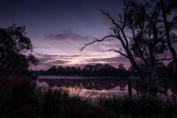
The Original image
First off let’s take a look at what the original image looked like.
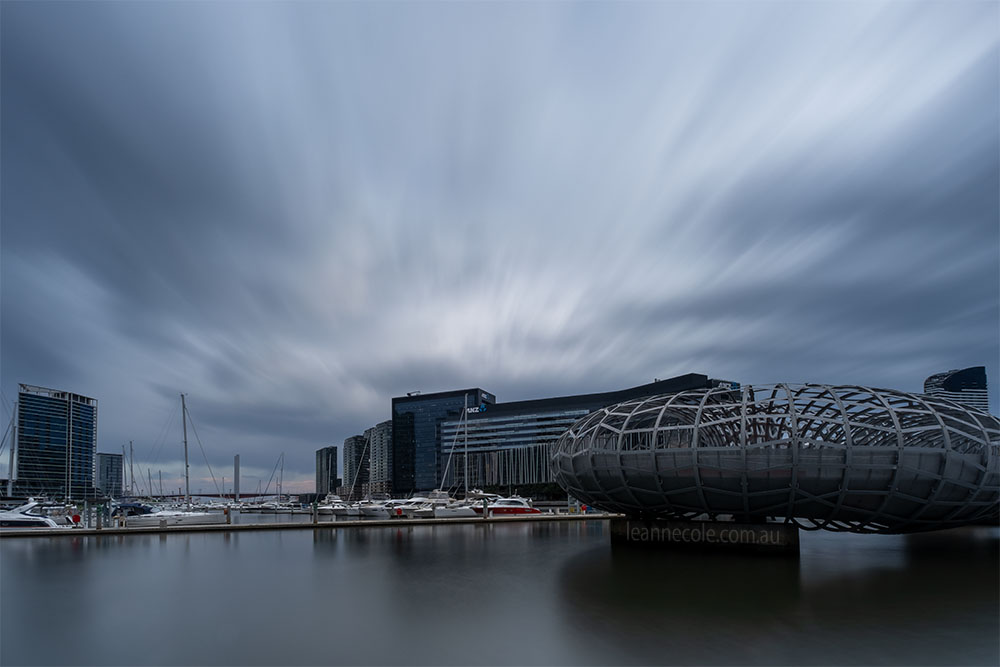
This is straight out of Camera Raw. It has had a small amount of processing but not much. It does look like a rather dull image. I saw more and the possibilities were endless.
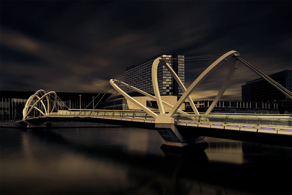
The Monochrome image
I’m not going to talk much about the monochrome image, you can go back to the blog post for that. Though I will say it has been one of my favourite monochrome images.
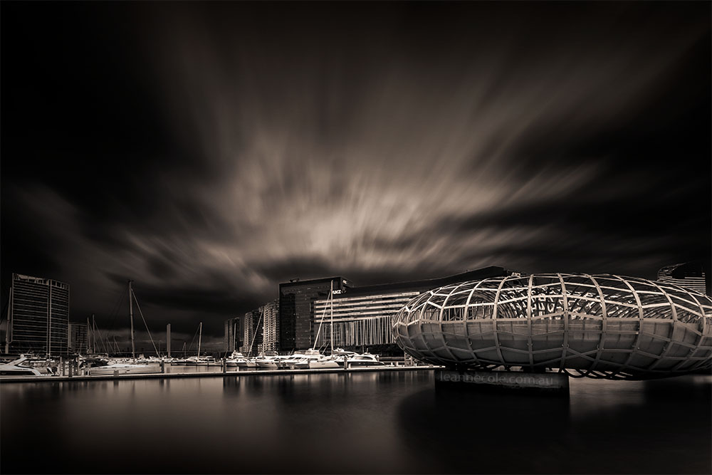
You can obviously tell from this that I have played around with the image a lot. I love playing with the light.
The colour image
When I was trying to decide what to do for Silent Sunday I remembered how I had done the reverse colour on this and thought it was make a great post. I hope you agree.
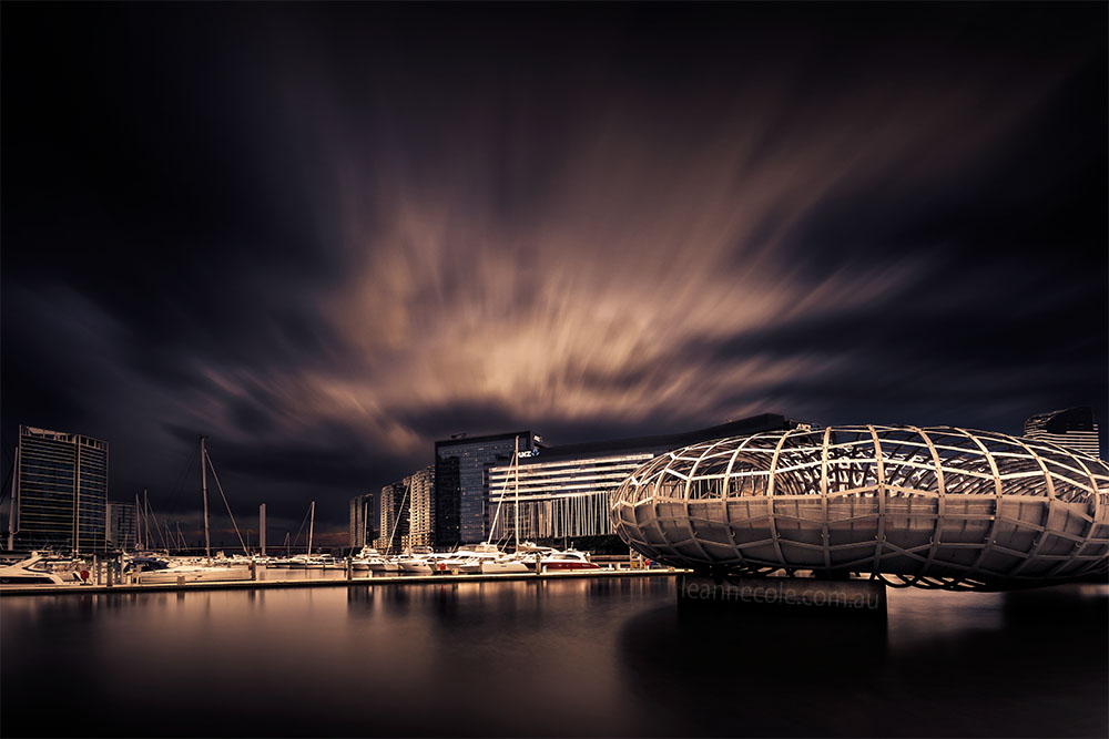
Does it work in colour? I’m not sure. Perhaps I like the monochrome version a lot more. It is interesting and something I think I might start doing more again.
I’m leaving this post here, I hope you have a relaxing Sunday.
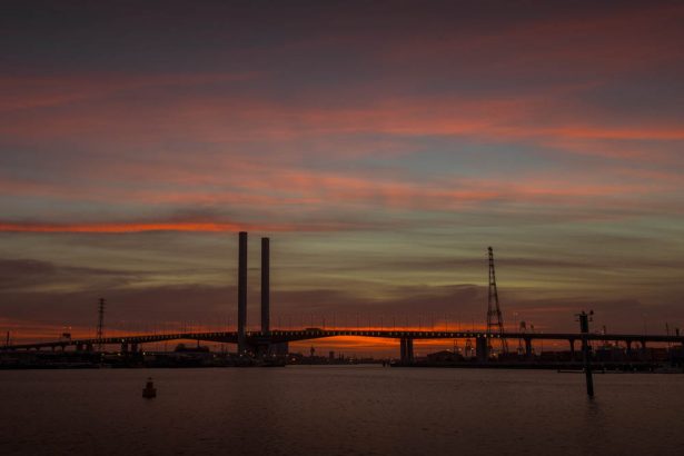
I always like the mood you create with the way you edit colour but, in this case, my preference is for the monochrome version as I think removing the colour makes all those interesting shapes more emphatic.
Thank you Laura, that is really good to hear. I feel the same way as you.