This morning I was in the kitchen making a coffee and Dave yelled out to me from the lounge room wanting to know if I knew about tilt shift.
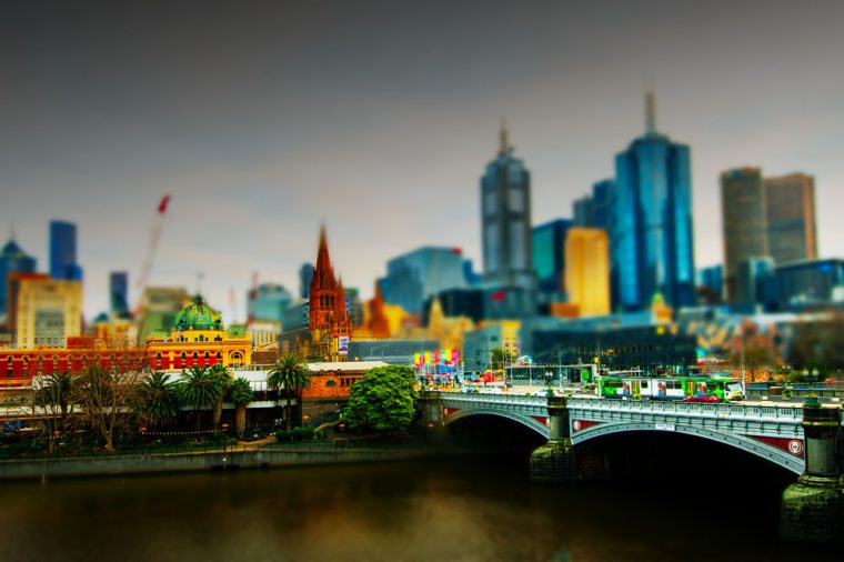
At first I thought he meant tilt shift lenses, but then I saw the YouTube video he was watching and realised it was the tilt shift where you make things look like models. It was a really popular technique quite a few years ago.
I said yeah, I know about that. It is about blurring most of the image and leaving some clear. I went on to explain that you have to be looking down on something to get it to work. I made him stop on a scene in the video and showed him how you could see where they had blurred the background. I have no idea how they do it for video, I don’t do enough of it, but I knew how to do it with photos. Actually, I knew the basics.
I told him that I thought it was easy to do. Well, my understanding is that it is easy. So I said I would see if I could do some and here are the results.


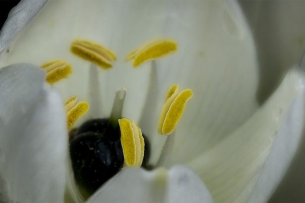
I find it hard to evaluate if they have worked because I know what the original looks like. Dave thought they looked like tilt shift and kept saying it was like looking at models of Melbourne.
I thought it might be fun to show them to you as well.
While it is easy to do, I did watch a tutorial on YouTube to show me how to do it. I knew there was more to it than just blurring part of the image. I think there are lots of tutorials about how to do it. It isn’t a new technique.
I hope you liked looking at these and if you want to see the original inspiration here is the video Dave was watching.
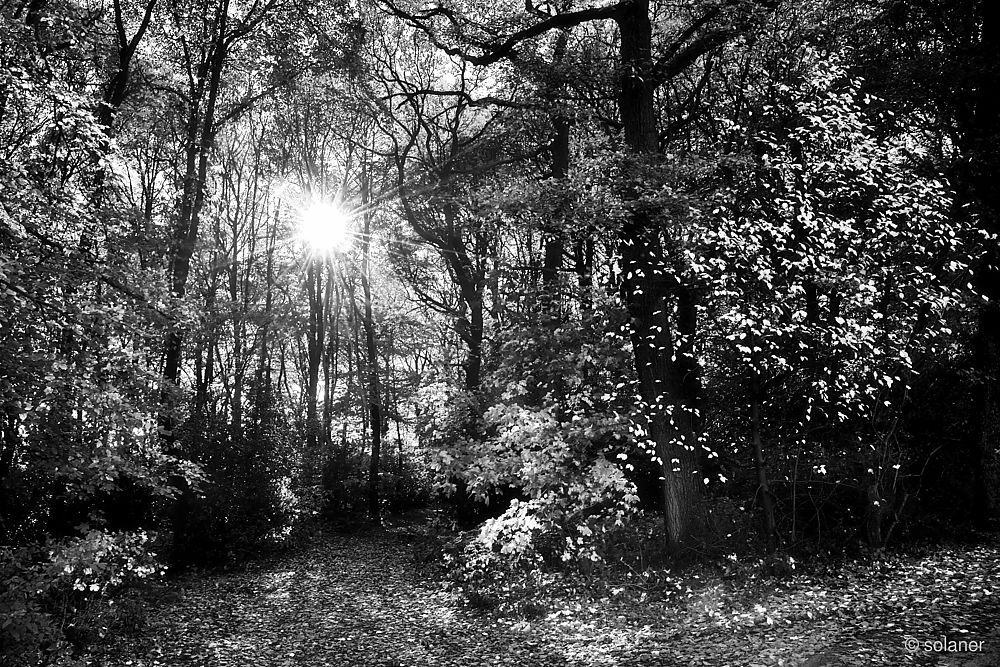
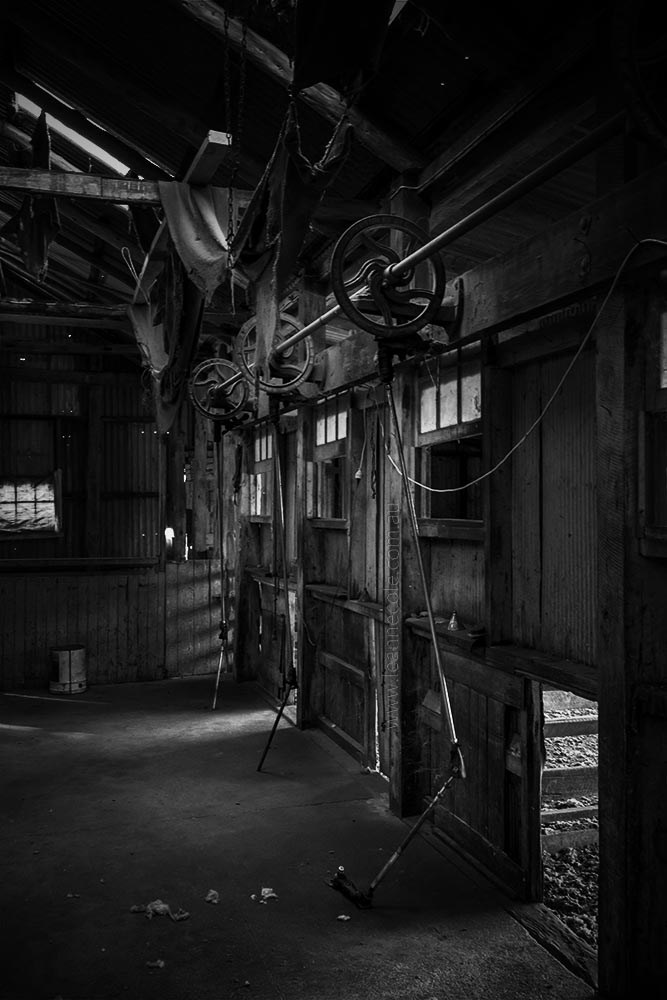
These are fun and certainly have that look of a model. I especially like the one of the marina/port, and the train in the station works very well too. I’m not sure I’ll want to try this but if I do I’ll watch that video for tips – thank you 🙂
I first learned about this technique years ago, but never really got into it, and the only reason I did this time was because I wanted to show Dave, but I don’t know that I would do it again. Good to hear which ones you think worked well. Thank you Sarah.
FUN!!!
Definitely, thanks.
They are all beautiful, but I like the one with the boats in the marina the best.
And like everyone says, the colors are great.
It’s a very good tip, and a lot of fun to do I think.
Thanks for sharing Leanne!
The one you like the most was the first one I did. Apparently that is part of the process to over saturate, which was very different for me. You’re welcome, good to hear you thought it was interesting.
I’m so glad you can tell what it is meant to be, I find it hard to tell. Thank you John.
😁😁
I loved these images. I think one thing that makes tilt shift really work well is having a lot of colors, as in your photos.
Yeah, colours definitely, you do have to emphasis them. Glad you liked them Egidio. Thank you.
Very interesting 😁😁
Thank you Ted, not something I would do all the time, but fun for this.
Looks like fun, ill have to take a stab at this 😉
Yeah, have a go Ed, it is fun, see what you get. Thank you.
Very interesting images and technique.
Thank you, though I did follow a tutorial.
I’ve often liked this look, but never had the patience with photoshop or GIMP to do it the way I liked.
Though I just thought of something that might be fun to do with this technique… maybe I’ll have to learn. (Or reach out for a collab since you clearly are better at PS than I ever will be).
The tutorial I found is pretty easy, though about 3 years old so some things have changed. It was easy to do.
Yeah we could have a go at that. It could fun, let me know how you want to proceed Matt.
It must be a WP issue, your words are still writing across the graphics. It probably doesn’t look that way when you click on the link to your site. I read thru Notifications which could also be why. Great learning experience. 🙂
Yeah, I don’t understand what they do half the time. Sorry to hear it keeps happening.
It’s life on WP.
It certainly is.