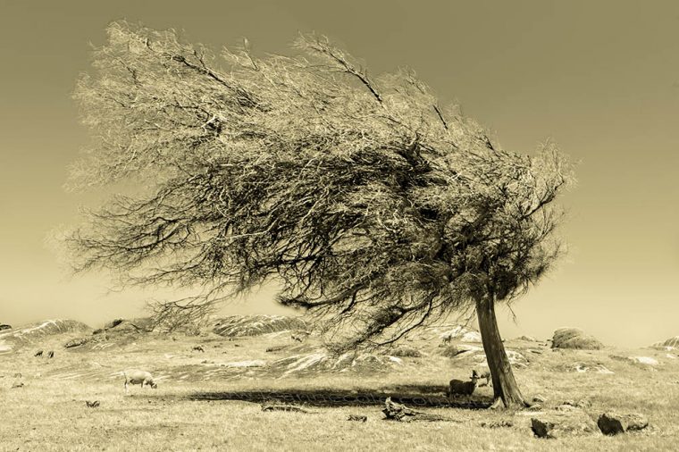
Here is the second week of the challenge that I did back in 2014 when my friend Robyn was running this challenge. It is funny to read.
Since I have that plugin for before and after, I decided to use it for this post, too, and I will try to remember to do it from now on.
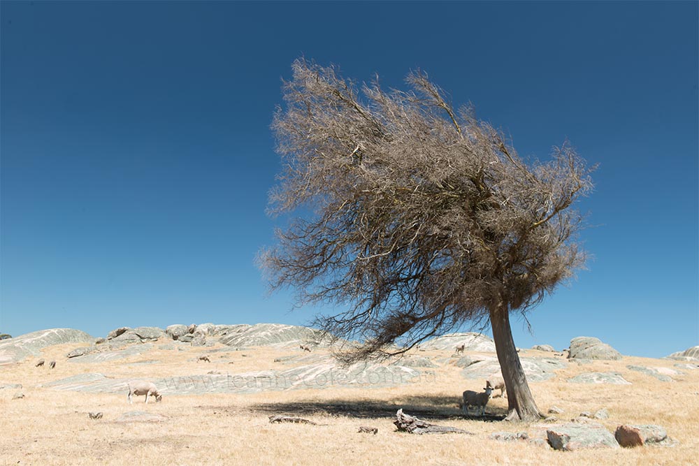
Here is the original image.
When I picked the tree image, I thought I wouldn’t have any problems trying to figure out four ways to process it, but I think I need to start thinking about this a little more. Next time, I will have to pick an image that I am fairly certain will work a lot better.
This week’s effort: I knew I wanted to try and make the tree bigger, and I wanted a washed-out colour look. I think I ended up with more of a monochrome look, but I don’t mind it too much. I wanted to see if I could overexaggerate an Australian summer day. I haven’t done that this time, but it is something I want to keep trying.
I have two more weeks to do something with this image. I am glad I have another week to start thinking about what I am going to do. I am sure I can do more with this, but I will have to try some more things. I have one or two ideas, but I am a bit worried that I am not very good at this. Oh well, hold onto next week, and see what I can do for it then.
I am going to always do a gallery with the original image, and each one that I have manipulated, I like being able to see each one, and I hope you do too.
If you want to see Week 1 here is the link.


As well as the photos, love that slider tool to view both images.
Thank you Geoff, yeah that slider is handy, I keep forgetting I have it.
This is interesting. I won’t vote till I’ve seen them all!
Thank you Margaret, two more to come.
Love the subject matter, Leanne.
Art
That’s great Art, thank you.
Thank you John, yeah I thought it would be fun to make the tree longer and more dramatic. Not sure about the face, lol.
Great imagination. 😂
So far, I like the last edit the best. It has definition and contrast that the other two don’t have.
Still two more to go Anne, I wonder how you will feel about those. Thank you Anne.
This is really amazing
Thank you Hammad.
it’s a great image, and looks good with the different effects
Thank you Beth.