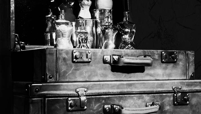
For Monochrome Madness this week I thought I would do a shot I got the other day at the Jean Paul Gaultier Exhibition that was on at the National Gallery of Victoria. There were some perfume bottles on top of cases and I thought they would make a great image, so I did Perfumes First in Monochrome and Then in Colour.

I like the monochrome version, but the perfume bottles get a little lost at the top, so I thought it might be better in colour. I like that reverse processing, so once I was done with the monochrome version I went back and changed it back to colour.

I think this one shows off the perfume bottles a lot more and a lot better. The cases might be a tad over saturated, but the perfume do look better. I think you can see the shapes of them much better.
Just need to remind people that you can comment on this post, and while it doesn’t look like anything happens when you do, it does. I get all the comments, though it can take me some time to approve and respond to them yet. I don’t know why this blog is so weird to leave comments on. I will have to get onto the developers and see what they can work out.
absolutely gorgeous!
Thank you.
wonderful colours!
Thank you.
amazing.
Thank you.
I Love the corseted bottles !!! Beautiful shots in both!! Again Happy Birthday!!!
I love them too Cybele, they are fascinating. Thank you and thanks again.
Magic … you know I think they look fabulous in mono and colour! I would have loved to have seen them.
Thanks Julie, they are so different in each form. I took so many photos in the exhibition, I am going to put them up as a Weeekend Wandering this weekend and I might put the overflow up here, so hopefully you will get an idea of what it was like. It was a great exhibition.