I’ve been cheating with Monochrome Madness by using images that are already monochrome, but today I decided to use an image I took recently and see what I could do with it.
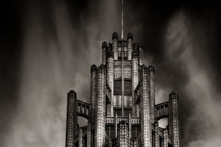
The building is the Manchester Unity Building in the city. It is a beautiful art deco building and sits on the corner of Collins Street and Swanston Streets.
I have taken many photos of it over the years and I was once given access to the interior of it as well. It is a special building for me.
While I was in the city recently with a friend we were trying to take photos of it without the tram lines. If you have ever taken photos in Melbourne, especially the city, you will know that there are tram lines everywhere and they can ruin a good image. If you want to get rid of them from your images be prepared for a lot of work. Thankfully we found a spot to photograph it through the lines.
Today I am going to show you the same image three times.
First up I am going to show you just the black and white image.
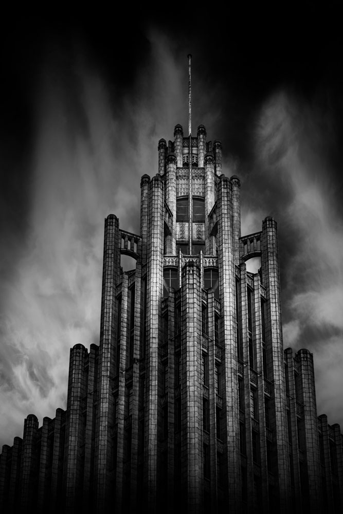
Secondly here it is with a slight blue tone.
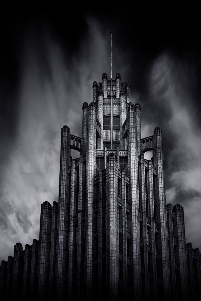
Finally, this one has a sepia tone.
I couldn’t decide which one I liked the best, so you get to see all three.
I asked my husband and he said he liked the second one. I like that one too, but the building is orange or a terracotta colour and I wasn’t sure it was right to do it with a blue tone.
Which one do you like best?
Participating in Monochrome Madness
If you want to post photos on your blog use the tag Monochrome Madness and then I can use the reader to see what you all post. Also, use the tag mid-week monochrome to catch Bren’s as well.
I’m afraid I don’t use Social Media much anymore, but maybe tag it #monochromemadness for Instagram and I will try and look. That would be brilliant.
Beautiful!
Thank you.
I like the sepia tone (third one) the best. Something about it seems creepy and eerie. I love horror, so naturally, that one drew my attention. They’re all beautiful, though, and thank you for sharing your photos with us 😊
It has been a toss up between the sepia and blue. I love the idea of horror. Thank you so much. I love sharing them.
You’re very welcome! The sepia looks more post-apocalyptic, and the blue looks more paranormal. Maybe I’m just too into horror haha. You’re very welcome 😊
I like your input. I always find it interesting to see what others see in my images. 😁😁
Thank you! And I agree. I find it interesting when people watch me ride my horses and give me their input on my riding. It’s always interesting
Yeah it is. I used to ride horses, many many years ago.
I love that. Horses really have changed my life. I currently have three horses 😊
They are such amazing animals. I know mine got me through some tough times.
Same with mine. I just love being around them ❤️
I have cats now and they are good for me.
Cats are wonderful! I wish I could have one, but my husband is allergic to them
What a shame, we have two, and they are wonderful. They can be so funny.
Aww. I love it! Cats are just so cute 🥰
They are and can be so opinionated.
Haha very true!
😂😂😍
Oh wow! I love the 3rd image best. It screams of stories untold.
Thank you for sharing that, good to hear.
I think I prefer the 2nd one, I line the tone that adding the blue hue gives the shot.
That is a popular one Ryan, I like it too. Thank you.
I need help to reach 50 likes on my post please help me for educational purposes only pleasee and follow also
Please stop doing this, this is not the way to do it. This is spam.
I like the sepia third one best – the processing suits the building perfectly
Thank you for letting me know.
Love #3
Thank you for letting me know.
Beautiful capture Leanne! I know this struggle – of trying to avoid the tram lines – it has ruined a lot of scenes! Who knew one day photographers would be complaining about this 😂. Out of the three variations, I like the 1st one the most. Inspired by you, I thought of playing with the filters and came up with this – https://flightsofthesoul.wordpress.com/2022/11/15/monochrome/
Thank you, I know, the tram lines can be a nuisance, though sometimes they seem important too. Thanks for sharing which one you like best.
I noticed in your post that you didn’t use the tag Monochrome Madness because it hasn’t come up on the reader under that. I will go back and look at your image more closely soon.
Thanks Leanne. I have used the tag. I don’t know why it’s not showing up in the reader. That is strange.
I don’t know, I see it is up the top, but then you have lots of tags at the bottom as well, I think the top is categories and perhaps it needs to be down the bottom.
Also does WordPress still limit how many tags you can use. When I was on it you could only use 10 or 15, so they took notice of the first 10 or 15, but not the rest. I don’t know.
All 3 versions are great – I think I’m partial to the sepia
Thank you Nora, and thank you for sharing which one you like.
If you’re into the “Underworld” (movie) look, number 3.
Art
I think I might be Art. Thank you.
Stunning images! Love what you done with them.
Thank you, that is good to hear.
The blue tone has got all the drama. That’s my pick♡
You aren’t alone there, it’s my pick too, thank you.
What a beautiful building. You’ve really captured the character of that building, I like all three shots, but I’m leaning more to the blue hue shot, if I had to choose just one.
It is an amazing building, one of my favourites. I think many have leaned towards that one Bren, thank you.
I thought I had mentioned your challenge too, I’m sure I put in to tag mid-week monochrome, but must have thought and not done, anyway, I have put it in now and will do so each week for you.
Thank you Leanne.
😍😍
I like the blue tone and what an incredible piece of architecture.
Thank you for sharing that Mary Anne. I agree it is so amazing. I often take photos of it.
Great photo Leanne. I think the blue tone is my favourite 🙂
Thank you Bushboy, you aren’t alone there, seems the blue is more popular. 😀
💖💖💖 it!
▪◾◼◾▪▫◽◻◽▫▪◾◼◾▪▫◽◻◽▫▪◾◼◾▪
▫◽◻◽▫▪◾◼◾▪▫◽◻◽▫▪◾◼◾▪▫◽◻◽▫
Thank you Graham.
Hi Leanne. I enjoyed seeing your b & w photos. So much fun to dive into those deep shades and equally as difficult sometimes to retain those white highlights. I love that you’re experimenting with adding hues. You never know how differently you’ll see an image by adding a pinch of color. My personal favorite from this series was the first one…the one with no hue. The building has a very strong presence (and fantastic shot of it btw). The hue’s seem to draw from the building’s own voice. I liked the true black and white. 🙂
Thank you Olivia. I enjoy adding hues to black and white images to see if it enhances them or not. So much easier these days than it was back in the dark room. Thank you for sharing which one you like. The building is a great landmark in Melbourne and does have that presence.
I think I like the blue one too but as you will see from the post on my blog, I am not sure if my eyes see as they should.
Yes, I just saw your image because of the tag, thank you for doing that. Thank you RJ, it is interesting how the blue works with the image.
I like the blue toned image best. All are great.
I think the blue one might be the most popular, thank you Anne. YOu will be able to see the building for yourself soon.
I like all three versions, Leanne, such a beautiful building!
It is, really stunning building, thank you John.
You’re welcome. ☺️
😀 😀
Strong Fritz Lang vibes – great photo!
I don’t know him, will have to go and look him, thank you for introducing me.
I was thinking of the silent film he made back the 1920s – Metropolis. The light around your photo really brought it to mind.
I think I have seen that, it is quite amazing. Thank you, that is so nice of you to say that.
i like the 1st one the best
Okay, that’s wonderful, thank you Art.