I’ve been going through older photos and looking for ones that I can convert to Monochrome. I have a massive catalogue of images and one of the problems is sometimes where to start.
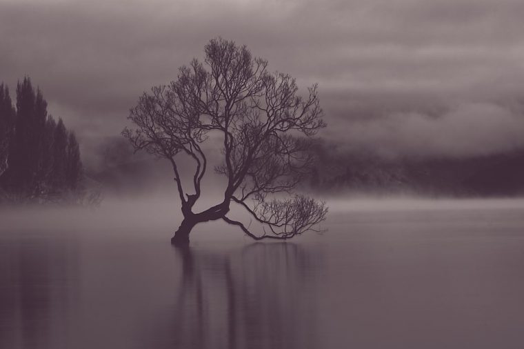
For some reason, I landed on the images I took in New Zealand back in 2019. Then I landed on one of the mornings I spent at the Wanaka tree. The one that sits in the water.
I have shown quite a few photos of this over the last 4 years, but I am not sure I have ever done one in monochrome. I think it is about time.
I found three images. The original plan was to do each one in Photoshop and then pick one. So I did the first two then I remembered that ON1 Photo Raw has presets and I’d been thinking about playing with them for a while, so I decided to do the last one in ON1 and then show you all three.
Photoshop Images
As I said I did two images in Photoshop first. They are different images and were taken at different times on the same morning.


You can see in the first photo that it was very misty in the background whereas in the second photo you can start to see the mountains back there.
It was one of the best mornings in New Zealand and one of the worse. If you are interested in seeing why then click here for the original post.
So I had one more image and I opened up ON1 Photo Raw
ON1 Photo Raw Images
I opened up the program, but had to wait for it to update. I don’t know if it is because I don’t use it a lot, but every time I open it up I have to do one.
Anyway, I opened up the image and decided to try a few things. There are a lot of presets you can use in ON1 and you can apply them to the image. I’m still trying to work out how they work and what you can do. Every time I use it I learn more.
While you can apply a preset you can also make changes to them as well.
I ended up doing the image four different ways. I thought it can’t hurt to show them all to you.


You can get very different results. It was a fun thing to do. I’m not always a fan of using presets, but they can be good to help you see what is possible. Do you have a favourite?
Do you ever use presets? What do you think of them?
Participating in Monochrome Madness
If you would like to participate in this challenge please post photos on your blog and use the tag Monochrome-Madness, as then I can use the reader to see what you post. Also, use the tag mid-week monochrome to catch Bren’s as well.
I’m afraid I don’t use Social Media much anymore, but maybe tag it #monochromemadness for Instagram and I will try and look. That would be brilliant.

Long live monochrome!
Absolutely, thanks Stephen.
I wound up buying ON1 for some of the portrait features. Using it as a plug in alone wasn’t too good, but the whole suite wasn’t too bad.
Love your photos… that tree is famous on its own, isn’t it?
(and sorry I haven’t been commenting… WP seems to have unsubscribed me again).
I don’t do portraits, so not sure how it works with that, but if you got the suite it must be good.
Thank you so much Matt. I don’t get what WordPress does sometimes. No problem.
I loved all your experiments, so I tried several presets and other buttons and gadgets I could manipulate. Hope you like them. https://alwayswrite.blog/2023/01/21/coffee-circles-to-ease-the-chill/
Thank you Marsha, I left a comment on your image.
Thank you. I didn’t know you could comment on images. I spent quite a bit of time playing with some of those images, then I’d look back at yours. I love the ethereal looks you achieved. 🙂
Yeah people do, but I didn’t think you could do it with mine. Thank you Marsha.
Wow this is amazing 🤩
Thank you.
These are all very dramatic, Leanne! My favorites are the black trunked ones, as opposed to the white, but I love the foggy background. Purple is interesting, but my favorite is the first one.
That’s great Marsha, I love hearing which ones people like. I like those too. Thank you.
You are such an artist.
Years of practice Marsha, thank you.
True that!
Epic💛
Thank you.
Hi Leanne – That’s an nicely haunting version of the image that you chose to work with👍 I’m unsure if there is a required theme to taking part in this challenge each week. Should I be following your lead or should I just post a b&w of my own?
Thank you, I love those images from New Zealand. There isn’t a theme, we all just do our own images. I look forward to seeing what you do.
Thanks Leanne – I have posted one for you 😎👍
It has come up in the reader, maybe just tag monochrome madness without the dash, not sure why.
Thanks Leanne – I shall modify the tag 😎👍
Great, I will look for it.
Beautiful!
Thank you.
Beautiful 😍My favourite is the misty one. The preset I like most is the one with the inky border. I prefer black black as opposed to the warmer tones.They are all wonderful 💗
Thank you Lesley. It is interesting to hear what people like, we are all so different. I tend to like tones and think it can add to the mood of the image, then again, if I was adding my own tones, not sure if I would have picked these either.
This definitely caught my attention. Such amazing images. Thanks Anita
Thank you Anita.
Beautiful, it looks like a painting! So moody and ominous.
I like that description as well Katherine, thank you so much.
I bet you had fun doing these Leanne 🙂
I did Bushboy, always fun to see what you can do. Thank you. 😀
Awesome varieties of that photo.
Art
Thank you Art.
So beautiful
Thank you.
It was very useful
Okay, thanks.
The Sepia style is my fave. That framing is cool. I filed down my negative housing on the enlarger to get the same results in the darkroom. Fantastic atmosphere in all of them to be honest. All the best.
That’s good to hear, it is always interesting hearing what people like. Oh yes, darkroom. I’ve tried doing it in other ways here too. Thank you so much, is it Gray?
They’re all atmospheric captures. The sepia style is other worldly. Yes, it is ‘Gray’. Short for Graham. All the best. 👍
Thank you Gray. I wouldn’t have thought Graham, there you go.
beauty
✨🦋💭🐇🗝🌱🌅☀⚖☺🤍✨
Thanks Graham.
Wow, the monochrome is giving the scene such a mysterious feel! Lovely!
I like that, thank you so much.
Nice! I used to use presets but I tend not to use them much nowadays, apart from the occasional image. After b&w conversion, I now use curves to dodge and burn different parts of the image with a brush and levels to adjust contrast.
Thank you Stuart. I don’t really use presets either, I like to have full control over them. I think most of us have our own ways of doing things, which makes it all wonderful.
I like all four in different ways.
That’s great RJ, thank you.
Amazing and beautiful images, Leanne! I wonder how the tree can live in water?
Thank you JOhn, I have no idea how it lives. It is incredible.