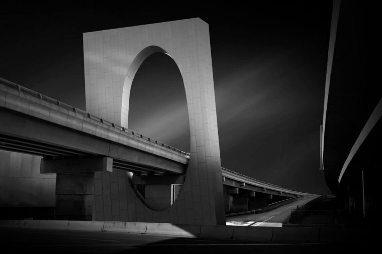
This is another image that I have shown before in colour. I have always wondered how it would look in monochrome, so here it is.
I do want to work on images from scratch, but I have been having trouble accessing many of my images. I think I told you a while back that I had trouble with storage. I had been trying to delete photos to make room, but it was such a laborious job.
I convinced Dave that I should just get more storage. I said if he got more for me I would make sure that I weeded my photos before transferring them so I wouldn’t have the same problem in a few years.
He has built a new NAS and I now have 21TB of storage. Woohoo. So I shouldn’t run out anytime soon.
The whole point of telling you all this is why I have just grabbed an image that I had previously processed and converted it into black and white. I don’t think it is cheating as you always learn something. It is also quite interesting how no matter how much you loved the colour version you always seem to have to do more to the image once you do the conversion. Little things.
If you would like to see the colour version, click here.

Participating in Monochrome Madness
If you would like to participate in this challenge please post photos on your blog and use the tag Monochrome-Madness, as then I can use the reader to see what you post. Also, use the tag mid-week monochrome to catch Bren’s as well.
I’m afraid I don’t use Social Media much anymore, but maybe tag it #monochromemadness for Instagram and I will try and look. That would be brilliant.
Works fine both ways, but I like the color version’s contrast between bluish near-white and yellowish near-white.
Interesting, I think you might be the only one that likes the colour one. Nothing wrong with that though, I usually prefer colour too. Thank you.
♥️♥️
😁
Leanne, both versions are magnificent but slightly leaning on the monochrome one.
That’s fantastic to hear Teresa thank you.
Both are really nice, Leanne!
Thank you Pam.
That’s an interesting piece of architecture – leaves a lot of why’s in my mind! Interesting B&W conversion – I’d have trouble choosing between the shots as both work well😎👍
I like that they built the freeway, but because it is right next to the city they choose to do some thing a bit different as well and make it visually attractive. Thank you.
Much love
😀
Stunning images, Leanne!
Thank you Amy.
Beautiful photograph!
Thank you Ashley.
Nice Monochrome picture
Lovely
Thank you.
Wow! I love this monochrome version of this photo! It’s almost haunting. Thank you so much for sharing your photos with us! 😊
Thank you. That is great. You’re welcome, thank you for looking at them.
Incredible post Leanne and nice Monochrome picture🔥🔥🔥
Thank you so much.
This is the first post I see from your blog Leanne and I love it. Regarding the photo itself, this is definitely a case where Black and White triumphs. I find that harsh lighting and geometric shapes = Black and White.
Welcome Jose, and thank you. I think you are right about what you said about what is good in black and white.
Amazing bridge. Dramatic photograph.
Thank you RJ, it is a freeway that goes through the circle. There are a few around there.
Wonderful shapes.
They are pretty cool.
Both are fantastic and each has a different feel to it. 😊
Thank you Pepper, that’s great.
Beautiful architecture and great capture Leanne! I like both versions but I think the b/w version is giving it a more mysterious feel.
Thank you, that’s great to hear. It is an interesting thing to try.
This caught my attention. Thanks Anita
Thank you Anita.
That does look fabulous as a monochrome Leanne. Still working on mine for this week 🙂
Thank you Bushboy, still plenty of time.
I think the colour version has a sort of futuristic, sci-fu vibe whereas the monochrome version is more architectural and sculptural. Both versions are great!
Í like the way you have described both versions Laura. Thank you.
That’s a beautiful photo, Leanne!
Thank you John.
👍✌
✨🦋💭🐇🗝🌱🌅☀⚖☺🤍✨
Thanks Graham.
Wow Leanne, they are both brilliant. I’m making myself choose, and I like the monochrome better. It’s just more dynamic in black and white.
Thank you Anne, I never know which to choose.