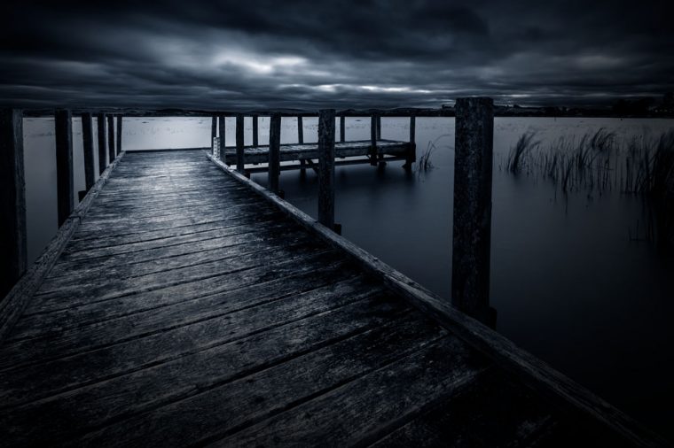
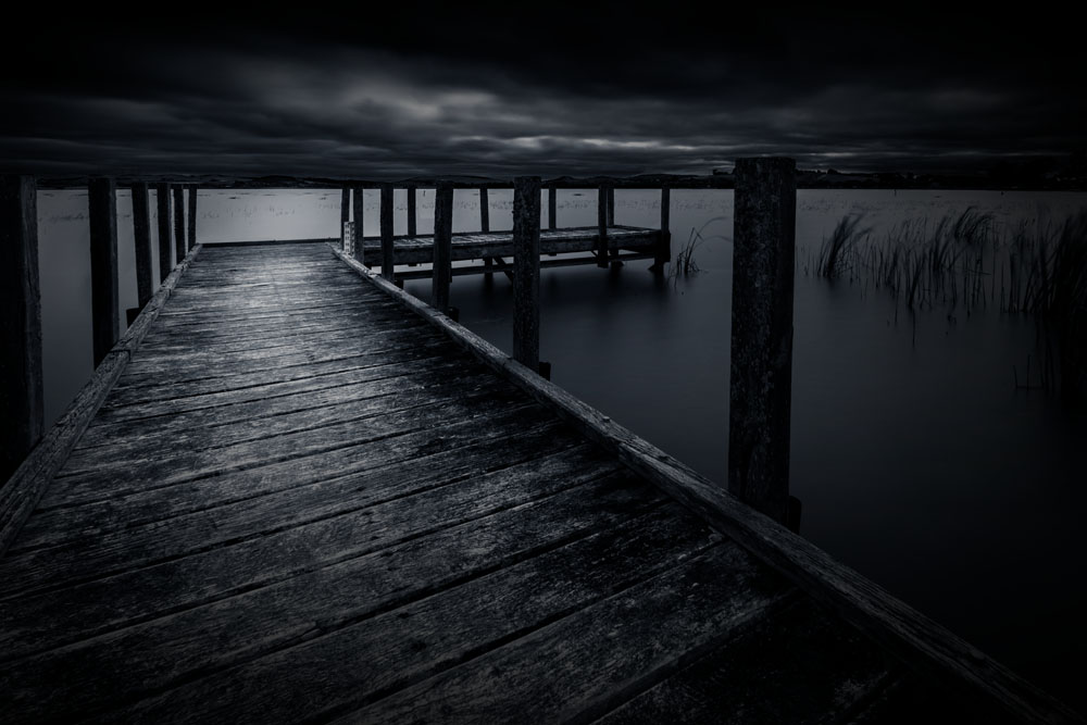
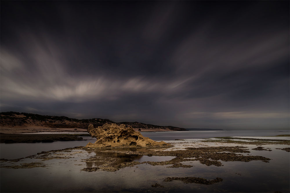
Today I have a photo from Lake Learmonth that I took a couple of months ago.
I went there a couple of years ago and the lake was basically empty, but with all the rain we have had in the last year or so the lake filled up.
If you want to see the photos from the first trip click here.
I did some long exposures there and I have done this one for you. It was taken during the day but I darkened it and put a blue tone over the top of it. Not sure about it, and after putting it here decided maybe the blue was too strong so I pulled it back. The image at the top is the original blue.
Participating in Monochrome Madness
If you would like to participate in this challenge please post photos on your blog and use the tag Monochrome-Madness, as then I can use the reader to see what you post.

This LA morning was begging for more light looking into the grey sunrise … but it felt dark and blue to me. 🙏🏼 https://palebluereminders.wordpress.com/2023/09/01/i-love-la-without-the-people-photojournal/
Hi! Just found your site. I was drawn by this image to read your comments and I think I agree with you that it’s too blue. The second edit is blue but the measure I always like to throw at myself is does it look authentic. However powerful edits are, I want to believe the image is possible…that I could walk up that day and see what you see. I will post a similar photo from a very early morning in Santa Monica off the pier and ask you the same. Lovely to meet here Leanne. 📸🙏🏼
A very nice photo
Thank you.
Love it!!
Wonderful, thank you Anne.
Love this and the blue tone. It’s haunting(ly beautiful) and reminds me of Camp Crystal Lake/Friday the 13th! Uh oh! ❤️ 😮
What a great comment, I always love hearing what people see in my images or what the remind them off. Thank you so much.
I rather like the blue tone but both versions work for me. I love the drama of the shot, especially the sky! And I’m joining in this week: https://www.toonsarah-travels.blog/gallery-newcastle-in-black-and-white/
I was worried the blue might be too much, but seems I was wrong. Thank you so much.
A sense of fragile calm under a heavy sky.
A good way of seeing it, thank you.
Such a great shot, I love the ambiance you’ve captured.
Thank you Rick.
I like the blue tone, it increases the drama.
Here is mine:
https://photographias.wordpress.com/2023/08/16/monochrome-madness-sweetheart-abbey/
Thank you Sofia.
I got the same impression as Mellow – a flat roof above the water!
My entry here:
https://flightsofthesoul.wordpress.com/2023/08/16/window/
Interesting, I didn’t see it at all, but now I need to go back and have another look. Thank you PR.
This is breathtaking, Leanne. The blue tone really sets that dark, stormy mood. Both are fantastic.
Thank you Time, I like how it made it look so much stormy than it actually was.
An amazing capture. Looks a bit eerie but amazing 🙂
Thank you Hammad.
Oh, I love this one!!
That’s wonderful Julie, thank you.
Fascinating illusion: the cloudy sky looks like the underside of a flat roof about 2 meters above the pier, supported by square columns that are really the pilings.
What an interesting way to look at the image, I love that. Thank you.
We get days like your second image. The thunderclouds roll in and it just gets dark. Well done. My contribution, a much less stormy flower.
https://blogger.googleusercontent.com/img/b/R29vZ2xl/AVvXsEjyISflSSXCxievTD-As2iJe04SWbnqHydDW3oPwPMY2ehHV8h4scF-0eVYTYpGSDbxRl3yfCp2Gq5Ej1lHzaTqVT2UU0tu3HXz06KVYVZS6IUDYwIWCtiHZ0z7phhHraDhA3c1totQQ1sC7ZjnzOkHODz-ZNBq_2m-5u4UhwbFkyahFYqCsgMzjX2TMzk/s1950/BW.png
Thank you Brian, I will take a look at yours soon.
I kind of like the blue, but either way it is a great shot.
I liked the blue, but I was worried that it might be too strong, it is still on the other image, but it is a lot more subtle. Thank you.