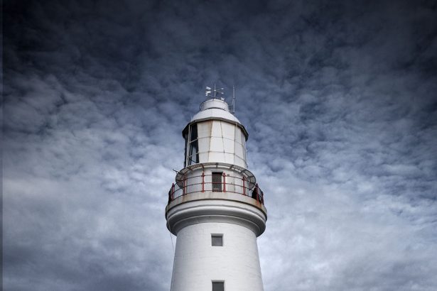
Today I have images for you that most ofyou have seen before, but they were in colour back then. I thought it might be interesting to see what you think of them in black and white.
I’m not someone who thinks everything is better in monochrome or black and white. Some things are better in colour, but today I thought you could judge.
This is going to require you to look at other blog posts here. Sorry.
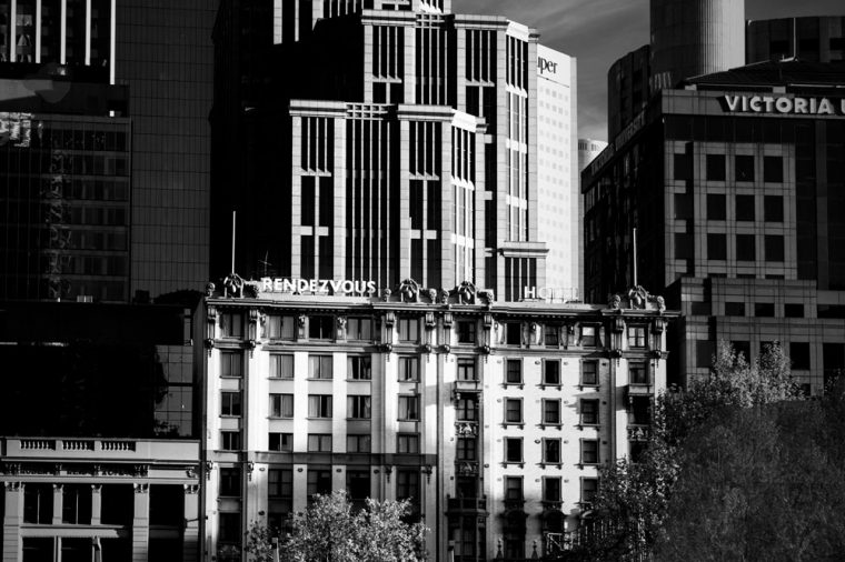
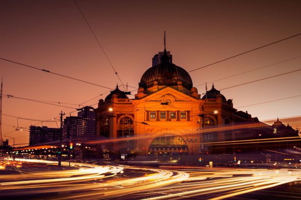
The first image is one that was taken across the river towards the city of Melbourne. It was fairly early in the morning.
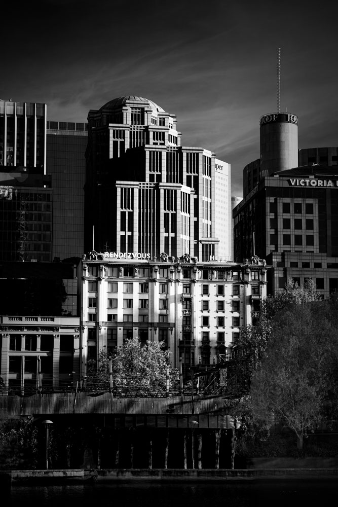
You have to love that early morning light.
The link to the colour version.
Back in the city – trying something different
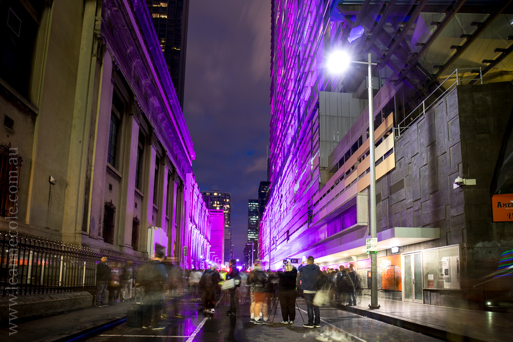
There are two more.
The first one I loved the shapes and the curved staircase. The colour image is almost monochrome as well. It seemed like a good image to make monochrome.
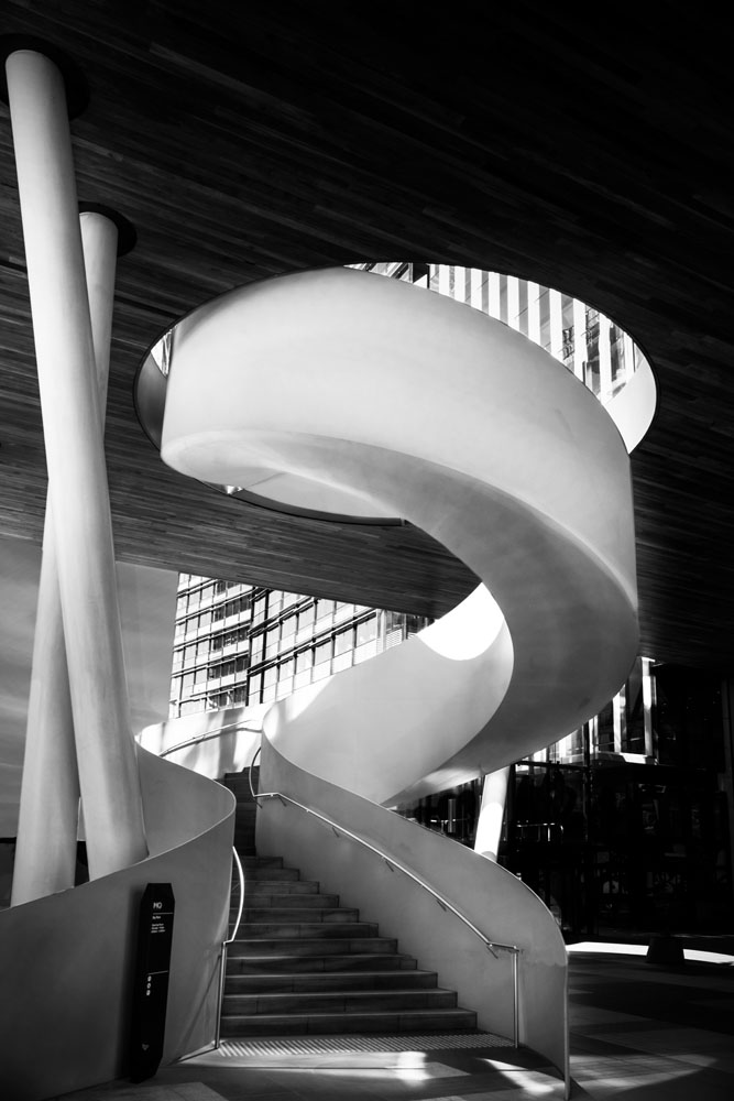
I’m really curious to hear what you think of the next one. It is hard to believe that the removal of colour always makes an image good.
I remember when I first posted this I thought the pop of colour was what made it. So you tell me if you think it loses something in monochrome.
Here is the link to view the last two images in colour.
Looking at architecture – Getting back into the city
Here is a gallery so you can scroll through the images.


Participating in Monochrome Madness
If you would like to participate in this challenge please post photos on your blog and use the tag Monochrome-Madness, as then I can use the reader to see what you post.
Hi having looked again, I slightly prefer colour, especially staircase image. All excellent anyway
I think you are one of the few that think that way, interesting. Thank you.
Hi, not sure if I prefer the monochrome to colour, I think possibly the colour in the first city scene, although purely subjective. Great images.
Always good to hear what people think, thank you Lawrence.
Black and white bring a whole other depth to images. It brings out details otherwise unseen by the naked eye.
That is true, you see something different when you take out the colour. Thank you Simona.
Black and white……right!
Right Geoff.
Whilst the colour images certainly catch the eye, the b&w images allow the eyes to focus on the whole shot & see greater detail 😃 Mine for this week: https://jezbraithwaite.blog/2023/08/04/greenan-tower-cbwc-monochrome-madness/
That is true, monochrome is good for that. Thank you Jez.
My favourite medium! Great photos. 🙂
It is one of mine too, thank you.
Leanne this is an amazing monochrome image . Anita
Thank you Anita.
Nice info
Thank you.
I like how the light draws focus in these photos. Helps keep the eyes where they need to be.
There’s something about the staircase that’s quite interesting but I’m not sure how to put it in words.
Maybe it’s the smoothness of the frame.
That is an interesting observation about the light. I think the staircase almost looks surreal, like it isn’t quite real. Thank you.
You do architecture photography so well and these monochromes are fabulous Leanne 🙂
Thank you so much Bushboy, I do love photographing it.
OK, firstly some feedback! For your first shot I like the colour version better I think – the monochrome is good but I like the warm tones in the framing trees and buildings contrasted with the cool tones of the central block. For the staircase, definitely monochrome, and I also thought your opening shot in that original post would be good in B&W – what do you think? On the last one, I like both equally. The colour version has the pop you mention, while the monochrome emphasises the contrast in architectural styles more and also has a bit of a sense of menace, feeling hemmed in.
Secondly, my own contribution this week, double-dipping with a second go at the Lens Artists challenge: https://www.toonsarah-travels.blog/gallery-unconsidered-trifles-in-monochrome/
Great feedback Sarah, thank you so much. I actually thought of putting that one in monochrome to see, maybe next time, or soon. I kind of agree with you on most of your points.
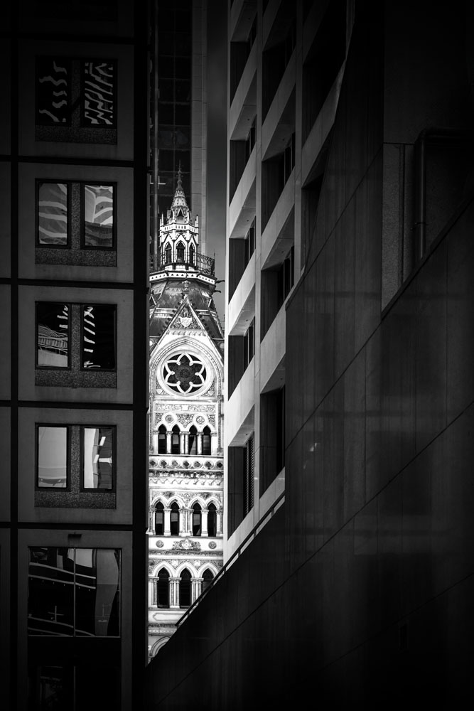
The only thing I’m worried about is that the concept/look/style of a building contradicts its use. Love the glimpse of the church between the new buildings.
Thank you Elke. That isn’t actually a church, it is the stock exchange building I believe. Thank you.
I meant the last shot – surely that’s a church?!
Yeah, that isn’t a church, I know it looks like one, but it’s the old stock exchange building, it is a beautiful building.
Amazing. 😮
Thanks.
In monochrome – for the first one, I like the names of the buildings that are standing out, and for the the second one of course it’s the twist of the staircase that’s cool. The third one – it looks great in both colored and monochrome. The colored one is indeed giving it a pop.
My entry here:
https://flightsofthesoul.wordpress.com/2023/08/02/on-the-riverside/
I have to agree with everything you have said PR, totally, I do love that staircase. I really like the third one in colour, though I wonder if in monochrome it works too because it is a very old building in between really modern ones. Who knows. Thank you PR.
Here’s my contribution to the madness:
https://brianwaddington.blogspot.com/2023/08/leanne-cole-does-monochrome-madness.html
Black and white for me, Leanne. The swirls of that stairway look so beautiful in B&W.
I don’t think you are alone Lois, seems to be monochrome all the way. I love that staircase, thank you.
Really digging this one!!!!
That’s fantastic, thank you.
I loved the staircase in this serie Leanne.
I love that image Rudi so I am glad to hear you do too. Thank you.
I definitely prefer the monochrome versions of the first and second photographs. I think the focus on shape, form, and light – without the distraction of colour – makes the architectural detail of the subject easier to focus on and more visually emphatic. The third one I was more ambivalent about because I really like the way the golden hue of the old building is peeking between the cold, grey tones of the modern buildings. It adds another layer of visual contrast. However, even with that shot, I think I lean towards the monochrome version because I think the tonal difference, with your aptitude with handling lighting, says enough about the juxtaposition. I also think I just have a personal prejudice towards monochrome for architectural studies.
I think I would have to agree Laura, though all the colour shots are very monochromatic as well, at least I tried for that. I thought the third worked better in colour, well I thought that before I converted it, then I wasn’t so sure. I don’t think you are alone with your prejudice Laura, I get the feeling many feel the same. I might have to experiment more. Thank you.
must say that i absolutely adore mo,ochrome for architecture.
It is very popular and many people do it. Thank you Jan.
Black and white photos like this are so dramatic. I love ‘em.
That’s wonderful Derek. Thank you.